The Dataset Browser provides an intuitive interface for exploring, managing, and interacting with dataset items. It enables users to efficiently navigate and analyze data at scale through the following capabilities:
.png)
Search & Navigation: Provides basic search, advanced filtering, and support for DQL queries. Enables efficient filtering, sorting, and browsing across multiple data types, including images, text, audio, video, LiDAR, and more. Collections, ML Subsets, Tasks and Statuses, and Semantic search
Dataset & Recipe Management: Allows users to upload individual files or entire folders directly into datasets.
Storage: DDOE enables seamless synchronization with your cloud storage. When a dataset is connected to a storage driver, a Storage button appears in the interface, providing visibility into the synchronization status and allowing you to upload files or folders directly into the dataset.
Data Visualization & Insights: Uses clustering techniques to visualize data distributions and identify patterns. Enables insight generation and dataset cleanup, such as removing duplicates or irrelevant items.
Item-Level Actions: Allows selected items to be added to labeling tasks, used in prediction workflows, or processed through integrated applications for downstream operations.
Access Your Dataset Browser
Access the dataset browser using one of the following options:
In the DDOE left-side menu, select Data.
For existing datasets, double-click on the name datasets to open the dataset browser.
For a new dataset, see the Create a dataset article.
In the Dashboard > Data Management widget, click on your Dataset name.
Your access is based on your Role and Permissions.
Dataset in Read-Only Mode
During export, the dataset enters Read-Only Mode to prevent changes. A warning message will appear in the data browser if the opened item belongs to a dataset currently being exported. While locked:
Saving and modifications are disabled.
Auto-save is off to avoid errors.
Save and Status buttons are disabled.
Actions will trigger an error message.
🔄 Use the Refresh button to check the latest status. Developer or Project Owner can click Unlock to unlock the dataset if needed. Read more
Dataset Details
The Dataset dropdown menu in the Dataset Browser provides key information and management options for the currently selected dataset.
.png)
From this menu, you can:
View user information: Displays the email ID and timestamp of the user who created the dataset.
View Embeddings: Opens details of the embeddings available in the dataset. Learn more.
Related-Tasks Analytics: Redirects to the Progress tab of the Analytics page, where you can collect, analyze, and derive insights from the dataset. Learn more
Copy Dataset ID: Shows the unique dataset ID. Use the Copy icon to copy it.
Export the dataset: Opens a popup where you can configure and export the dataset in JSON format. (Learn more). Learn more
Clone Dataset: Create a duplicate of the dataset.
Recipe:
Use Unique Recipe: If the currently assigned recipe is the project recipe, you can switch it to a unique recipe.
Use Project Recipe. If the currently assigned recipe is a unique recipe, you can switch it to the project recipe.
Delete All Annotations in the dataset.
Delete the Dataset.
Embeddings
The Embeddings section on the right panel after clicking on Datasets → View Embeddings provides crucial information about the feature vectors associated with the dataset. Here's a detailed breakdown:
Feature set: The label indicates that the feature set name. For example, clip, nnlm, text-embeddings, etc.
Feature vectors: The value refers to the number of feature vectors generated, corresponding to the number of items in the dataset.
Status: The status (for example, Success) signifies that the embedding process has been completed successfully, meaning all the items have been processed to generate their respective feature vectors without any issues. Available Statuses are Success, Running, Created, and Failed.
Updated At: This field shows the date that the embeddings were last updated. It indicates the most recent time the feature vectors were recalculated or updated based on changes in the dataset.
Model Application Name: If available, it displays the name of the model used to extract the feature vectors.
Add Embeddings
Click Add to select a model to extract embeddings for the selected items. It displays the Extract Embeddings side-panel, where it allows you to select the deployed model to start the extraction process by clicking on the Embed.
Also, select the checkbox to enable the Automatically run on new dataset items feature.
If you have extracted embeddings using a model, the following actions are available when you click the three dots:
Open Model: Click this option to open the Model's details page.
Run on New Items: Click this option to initiate the extraction process for new items added to the dataset.
View Logs: Click this option to open the Service Logs page.
View Executions: Click this option to open the Service Execution page.
Select Model: If the Dataset has no embeddings, click Select Model to browse the project model registry to choose an embedding model. It displays the Extract Embeddings side-panel, where it allows you to select the deployed model to start the Extraction Process by clicking on the Embed.
Recipe Details
The Recipe dropdown menu in the Dataset Browser provides key information and management actions for the selected recipe.
.png)
Available options include:
Recipe Details – Displays the recipe name along with its creation and last updated dates.
Quick Preview – Opens a preview of the recipe for quick reference.
Open Recipe – Opens the recipe in a new browser tab.
Copy ID – Copies the recipe ID to the clipboard and confirms the successful copy.
Export Ontology – Exports the recipe’s ontology in a JSON format.
Replace Recipe – Allows you to replace the current recipe with another one. When selected, a popup appears where you can select a new recipe from the list to apply.
Upload Items and Folders
DDOE enables seamless dataset management by allowing you to upload data directly into its file system or sync from external cloud storage solutions. This flexibility ensures efficient data organization and easy accessibility within the platform.
Learn more about upload.
Storage Driver Details
When a dataset is connected to a storage driver, a Storage button becomes available in the interface. This menu provides access to storage synchronization settings and upload options, enabling seamless integration between external storage and your dataset.
Available Options include:
Sync Details – View information about the current synchronization status between the dataset and the connected storage driver.
Sync Now – Manually trigger synchronization to ensure the dataset is up to date with the latest changes in the storage.
Upload Files / Folders – Upload individual files or entire folders directly to the dataset.
Item View Options
The Dataset browser offers two viewing options, Icons and Details. By default, the thumbnail view is shown, and you can use the respective View icons to switch between these options.
Icons View
Initially set to Icons view, showcasing smaller versions of items in a dataset includes images, documents, and video files arranged in a preview grid.
Audio, Lidar, and RLHF files are represented by a thumbnail indicating the data type, without an actual preview.
Items are organized by their latest upload date.
Allows for quick browsing and selection of specific content without needing to open each item.
In the Icons view, you can:
Adjust the size using the slider control at the bottom left of the page.
Use smaller to view more items on a page.
By default, the Show File Name option in the Settings is enabled to show the file names. You can toggle it to hide the file names.
Use the Sort By option to sort the items in the dataset. By default, the items are displayed according to the Creation Date.
Items color-coded as Green
Items with * Green color indicates that the item is annotated, and No Color indicates that the item is not annotated.
Types of icons for Items
Each item in the Data Browser is represented by a specific thumbnail (available only for video and image items) icon, determined by its type. The available types of icons are shown below:
Details View
In this view, users can see a list of items with their associated details including File Name, File Created Date, Media Type, Item's annotation status, etc. This makes it easier to access and review specific information about each item in a structured and organized manner.
In the Details view, you can:
Click on the checkbox next to the file name to select all the items in the current page.
Click on the Manage Columns to hide columns.
Sort items based on the Columns.
Common Features
Create Task: Clicking the Create Task button allows you to start creating labeling tasks for the selected items.
Selecting an item displays a preview of the item on the right-side panel. At the same time an Actions option is displayed where you can click to perform the available actions on the selected item.
The Select All option selects all items on the current page. At the same time an Actions option is displayed where you can click to perform the available actions on the selected items.
The number of selected items is highlighted.
Total number of dataset items, and breadcrumbs navigation to give a clear path back to higher levels, such as sub-folder and folder.
Settings
Show File Name:
Show Hidden Files: By default, the Show Hidden Files option is disabled. You can toggle it to show the hidden files.
Show Annotations:
Auto-Open Item Details:
Keyboard Shortcuts:
Items per page: By default, 100 items are displayed per page. You can select 2, 25, 50, 100, 250, 500, and 1000 items per page.
Use the page navigation options to view next and previous pages, or enter a specific page number and click Go to view the page.
EXIF Orientation and Image Display
DDOE automatically interprets EXIF (Exchangeable Image File Format) metadata to display images in their intended orientation. EXIF metadata contains image-related information such as camera settings, capture date and time, and orientation values.
When an image is opened in DDOE, the platform reads the EXIF Orientation value and automatically rotates the image for display, ensuring it appears correctly regardless of the camera's physical orientation when the image was captured.
Supported EXIF Orientation Values
DDOE supports EXIF orientation values 1 through 8. Any value outside this range (for example, 0) is ignored.
|
|
|
|
|
|
|
|


Annotation Considerations
Annotation coordinates (x and y values) are always stored relative to the image as it is displayed on the screen at the time of annotation.
Because different applications handle EXIF orientation differently:
Some systems (such as OpenCV) may ignore EXIF orientation metadata.
Some applications and browsers may automatically rotate images based on EXIF metadata.
To ensure consistent annotation coordinates and compatibility across tools, DDOE strongly recommends uploading images that are already saved in the desired orientation whenever possible.
Thumbnails
Image thumbnails displayed in the Dataset Browser are not automatically rotated based on EXIF orientation metadata.
EXIF Information in Annotations
To improve compatibility and accuracy, DDOE stores the EXIF orientation value used during annotation within the annotation metadata. This enables downstream applications and integrations to interpret annotation coordinates correctly when working with images that contain EXIF orientation information. For annotation metadata details, read here.
Keyboard Shortcuts
You can use Keyboard shortcuts to perform various actions on the items in your dataset browser. 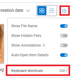
To view the list of available keyboard shortcuts, click on the Settings icon top right-side of the dataset browser menu bar.
.png)
When No selection
Single-click: Select a single item
If the "Auto-open item details" view setting is enabled and the panel is hidden, the item's details will also open
Double-click: Open the clicked item in the default studio in the same tab
Right-click: Open the action menu for all selected items
Up/Right/Down/Left: Navigate and select items
If no item is selected: Navigation starts from the last clicked item; first click (any key) starts from the first item
When an Item is Selected
Shift + click: Select all items from the first selection until the clicked item
Ctrl/Command + click: Add the item to selection or remove from selection
Space: Open item info
Enter: Open the item's default studio in the same tab
Ctrl/Control + Enter OR Ctrl/Control + double left-click: Open the item's default studio in a new tab
Up/Right/Down/Left: Navigate and select items and show info
Navigation is based on the last clicked item; first click starts from the first item
Shift + Up/Right/Down/Left: Extend or shrink selection
Ctrl/Command + A: Select all items (across all pages)
Esc: Clear all selection
When Item Detail (Item’s Preview) is Opened
Space/Esc: Close item info
F: Toggle full screen details mode
On Full Screen
]: Toggle the side panel show/hide
Items Preview
Selecting an item displays a preview on the right side by default, where you can view the details of the selected item.
.png)
Notice
You can disable this preview auto-open feature via the Settings icon.
In the Preview, you can:
.png)
View next (>) or previous (<) item clicking on the respective icons.
View full screen by clicking on the full screen view icon.
On the top the item, you can:
View the filename
Hover-over and click on the copy icon next to the file name to copy:
File Name
File Path
Item ID
Item Link
Click on the Three-Dots lists the available actions of the item.
General Details
Choose an item to view the following details in the right-side panel:
Created at: The creation date of the selected item.
Created by: The email ID of the user who created this item.
File path: The folder path where the file is located. Click on the copy icon to copy the file path.
Collections: Displays the collection folder name of the selected item.
ML Subset: Displays the ML Subset tab if the item has been assigned to a subset, such as
Validation,Test, orTrain.Item Description: The text description of the item. Click on the pencil icon to add or edit descriptions. Also, item descriptions can be added during file uploads, serving as an additional way to search for items containing specific text or descriptions.
Tasks and Annotations
The Tasks and Annotations sections displays number and type of annotations, and annotation task status available in the item.
Automation
The Automation section displays available function execution of the selected item. You can search executions by function, application, or pipeline. Also, the following details are displayed:
Pipeline: The name and link of the pipeline. Click on the link to view the pipeline.
Application name: Name of the application.
Function name: Name of the function.
Execution Status: Success, Running, Created, and Failed.
Updated At: Date and time of the execution update.
Rerun: If needed, click the Play icon to rerun the execution.
Filter icon: Filter executions based on the status, such as Success, Failed, Running, and Pending.
Logs and Executions
Click the link to access a comprehensive overview on the Executions or Logs page.
Metadata
Item metadata refers to the descriptive information and attributes associated with individual items within a dataset.
You can perform the following actions:
Click on the copy icon to copy the metadata.
To edit the metadata:
Click the Edit icon to open the editor.
Make changes as required.
Click on the Save icon to save the changes.
Show Hidden Files
In the Dataset Browser, click on the Settings icon.
Enable the Show Hidden Files option.
The hidden files will have the hidden icon (crossed eye) in the corner of the hidden item/folders. Also, the thumbnail will be grayed out.