Overview
A GenAI / Multimodal Recipe defines how you evaluate GenAI outputs in DDOE. It is a JSON configuration that controls the full evaluation experience, including:
The structure and layout of the evaluation form
The fields and components shown to evaluators
The user interaction flow
The validation rules and logic applied to submitted data
This recipe is best suited for AI output evaluation and validation, rather than traditional data annotation workflows.
Multimodal Recipes support multiple GenAI output types, such as text, multimodal outputs, and conversational responses. You can:
Use pre-built recipes for common evaluation use cases
Create custom recipes by editing the JSON directly
It is especially useful for human-in-the-loop evaluation, quality assurance, and model comparison, where subjective judgment and structured scoring are required.
Common use cases include:
LLM response evaluation and ranking
Image–text alignment and relevance checks
Human feedback collection and scoring
Structured GenAI benchmarking and model comparison
Layout | Layout Builder |
|---|---|
A Layout defines how the evaluation form appears to the user. It controls the visual organization of the form, including:
The layout focuses on presentation and flow. It does not define business logic, data storage, or validation rules. | It allows you to create and manage layouts using a visual interface. You use the Layout Builder to:
The Layout Builder automatically updates the layout configuration inside the Multimodal Recipe. |
Types of GenAI / Multimodal Recipes
The GenAI / Multimodal Recipes feature lets you build evaluation recipes tailored to different annotation task types.
Available recipe types:
Prompt–Response RLHF: Supports structured prompt engineering workflows, enabling annotators to evaluate and rank AI-generated responses in a questionnaire-style interface. You can use conditional logic to dynamically show or hide questions.
Standard GenAI Evaluation Recipe: A customizable, template-based layout for multimodal GenAI evaluation, allowing annotators to provide structured feedback on AI-generated content. Ideal for quickly getting started using prebuilt templates.
Unique GenAI Evaluation: A fully customizable, multimodal evaluation layout that lets annotators provide feedback on AI-generated content. Designed for building a studio layout entirely from scratch.
Create Prompt-Response RLHF Type Recipes
Supports structured prompt engineering workflows, enabling annotators to evaluate and rank AI-generated responses in a questionnaire-style interface. You can use conditional logic to dynamically show or hide questions.
Open Recipes from the left-hand navigation panel.
Click Create Recipe to bring up the configuration dialog.
.png)
Choose the GenAI / Multimodal. An annotation tasks type selection window appears.
Choose the Prompt-Response RLHF option from the list.
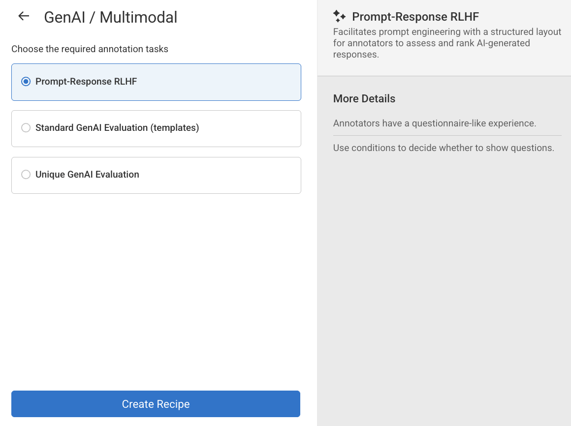
Click Create Recipe. The Recipe page will be displayed, and you can start creating or configuring:
Labels
Attributes
Annotation tools
Instructions
Advanced Settings
Create Standard GenAI Evaluation Type Recipes
A customizable, template-based layout for multimodal GenAI evaluation, allowing annotators to provide structured feedback on AI-generated content. Ideal for quickly getting started using prebuilt templates.
1. Open the Recipe menu
Open Recipes from the left-hand navigation panel.
Click Create Recipe to bring up the configuration dialog.
Choose the GenAI / Multimodal. An annotation tasks type selection window appears.
Choose the Standard GenAI Evaluation (template) option from the list.
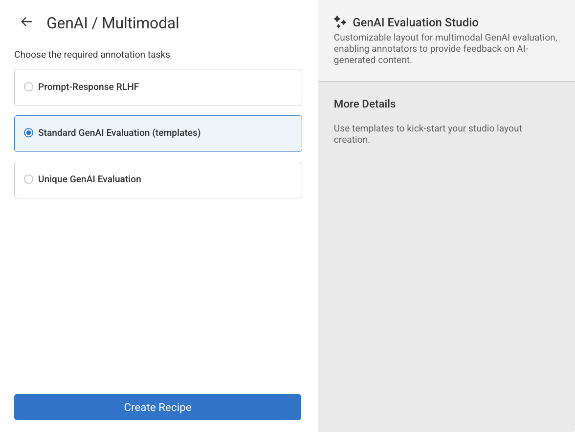
Click Create Recipe. The GenAI / Multimodal Recipe page will be displayed and you can start configuring with a temple from the left-side panel:
Templates (from the left-side panel)
Layout & Data
JavaScript
CSS
Sample Data
Instructions
Advanced Settings
2. Design the Layout
The editor displays a sample format by default. Use your own scripts (including JavaScript and CSS), if required. Refer to the Components library to view various components and its properties can used to customize your recipe structure.
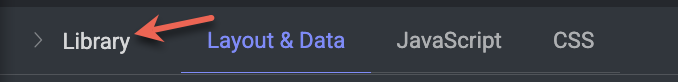
Otherwise, click on the Library tab to view and use the predefined Templates.
To use a template, follow steps below:
Select a template from the Library, and click Use Layout.
🚨 Once you confirm, the current form and layout will get overwritten by the selected template layout🚨 . Users can also check examples from the templates and copy and paste them to they own template (after clicking "back to edit").Click Use Layout to confirm it.
3. Generate Sample Data & Upload the JSON
After finalizing the layout, open the Sample Data section and click the
</>icon.A Python Usage Sample dialog appears containing an auto-generated script.
Click Copy to copy the code.
Run the script in your environment to upload a JSON data file into the target dataset while tagging it for evaluation-studio processing.
Click on the Copy icon to copy the python script and run the script to upload the
jsonfile to your dataset. Sample Python script is shown below:
import dtlpy as dl
import json
import io
# Get the dataset
dataset = dl.datasets.get(dataset_id='undefined')
# Create a io.BytesIO object from the data json
data = {
  "chat_a": [
    {
      "role": "user",
      "content": "Hello!"
    },
    {
      "role": "assistant",
      "content": "Hi there! How can I help you today?"
    }
  ],
  "chat_b": [
    {
      "role": "assistant",
      "content": "Good morrow, gentle friend!"
    },
    {
      "role": "user",
      "content": "Hi!"
    },
    {
      "role": "assistant",
      "content": "Hail, good sir or madam! How may I be of service to thee?"
    }
  ]
}
buffer = io.BytesIO(json.dumps(data).encode('utf-8'))
buffer.name = '68404c727b5a5a853549a9a8-data.json'
buffer.seek(0)
item = dataset.items.upload(
    local_path=buffer,
    item_metadata={
        'system': {
            'shebang': {
                'dltype': 'evaluation-studio'
            },
            'evaluation': {
                'layoutName': '68404c727b5a5a853549a9a8'
            }
        }
    }
)
print("Item uploaded successfully:", item.id)
print("Open in platform:", item.platform_url)
4. Save and Create the Recipe
Click Save
5. Run an Evaluation
Locate the uploaded JSON item in the dataset.
Open it with Multimodal Layout Studio.
The Studio loads your Multimodal Recipe, allowing reviewers to fill in responses, raise flags, and leave comments.
All inputs are validated automatically—basic required-field checks plus any JavaScript rules you added—blocking invalid submissions.
Recipe Structure
A Multimodal Recipe (written in JSON format) describes:
Sections: Logical groupings of form elements (similar to tabs or blocks), organizing the form into manageable parts.
Layout Direction: Defines the arrangement of components within sections — either horizontal or vertical.
Components: The actual interactive elements used in the form, such as text inputs, sliders, file uploads, ratings, conversations, media viewers (image, audio, video, markdown, external URLs), and more.
Logic: Rules for conditional visibility, dynamic behavior, hierarchical dependencies, and validation logic.
Styling: Custom CSS definitions that control the visual appearance of the form and its components.
Behavior: Custom JavaScript modules that introduce advanced interactivity, dynamic validations, and real-time form manipulation.
A recipe template has the following sections:
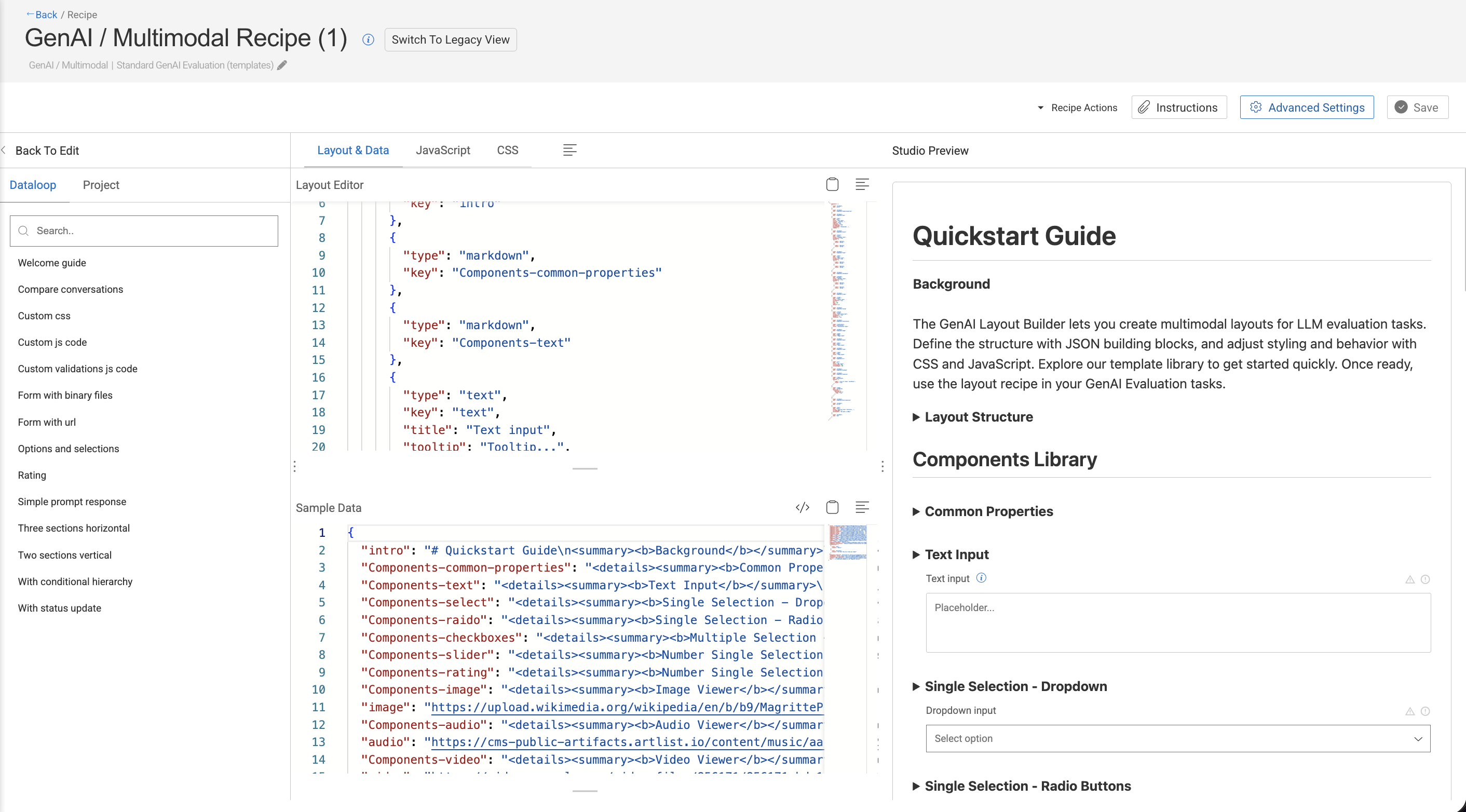
Layout Editor
The Layout Editor is a critical tool in the recipe creation process. It lets you design and control the structure of the evaluation form used by annotators in the studio. You can:
Customize your own layout using JSON schema.
Choose from a variety of UI components such as:
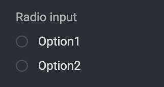
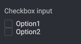
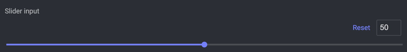
select– dropdownstext– text inputs or promptsradio– radio buttons for single-choice selectioncheckbox,slider, etc.
For example,
[
  {
    "components": [
      {
        "type": "markdown",
        "key": "intro"
      },
      {
        "type": "text",
        "key": "text",
        "title": "Text input",
        "tooltip": "Tooltip...",
        "hidden": false,
        "required": true,
        "errorMessage": "Error message...",
        "placeholder": "Placeholder..."
      },
      {
        "type": "markdown",
        "key": "Components-select"
      },
      {
        "type": "radio",
        "key": "radio",
        "title": "Radio input",
        "options": [
          {
            "label": "Option1",
            "value": "Value1"
          }
        ]
      },
      {
        "type": "markdown",
        "key": "Components-checkboxes"
      },
      {
        "type": "checkbox",
        "key": "checkbox",
        "title": "Checkbox input",
        "options": [
          {
            "label": "Option1",
            "value": "Value1"
          }
        ]
      },
      {
        "type": "markdown",
        "key": "Components-slider"
      },
      {
        "type": "slider",
        "key": "slider",
        "title": "Slider input",
        "min": 0,
        "max": 100,
        "step": 1,
        "default": 50
      },
      {
        "type": "markdown",
        "key": "Components-video"
      },
      {
        "type": "video",
        "key": "video",
        "title": "Video player"
      },
      {
        "type": "image",
        "key": "childField",
        "hierarchy": {
          "condition": {
            "parentField": {
              "$eq": "true"
            }
          }
        }
      },
      {
        "type": "markdown",
        "key": "Components-more-conditions"
      },
      {
        "type": "markdown",
        "key": "js-css"
      }
    ]
  }
]
Sample Data
In the GenAI / Multimodal Recipe of the DDOE platform, the Sample Data section plays an essential role in the design and testing process for annotation workflows—especially within the GenAI Evaluation Studio. It allows you to populate placeholders in your Layout Editor with sample inputs. It also displays a sample of the annotation output after interacting with the Studio preview. DDOE highly recommends exploring the preview yourself to better understand how the configuration behaves and how the outputs are generated.
The Sample Data section is designed to simulate or preview how a layout will behave before integrating real data or running actual annotations. It allows developers, annotation leads, and evaluators to:
Populate the layout with mock inputs.
Validate the design, spacing, logic, and visibility conditions in the Studio Preview.
Test dynamic elements like JavaScript validation or conditional formatting in the Studio Preview.
The following JSON snippet defines separate chat histories: . These are matched to UI components (e.g., two chat boxes) created in the Layout Editor.
{
"intro": "# Quickstart Guide\n<summary><b>Background</b></summary>\n\n<br>\n\nThe GenAI Layout Builder lets you create multimodal layouts for LLM evaluation tasks. Define the structure with JSON building blocks, and adjust styling and behavior with CSS and JavaScript. Explore our template library to get started quickly. Once ready, use the layout recipe in your GenAI Evaluation tasks.\n\n\n<details><summary><b>Layout Structure</b></summary>\n\n<br>\n\nA layout is a JSON array of blocks, each defining a set of components and settings:\n- `title` (string): Display blocks title\n- `hidden` (boolean): Hide the entire block\n- `layout` (object): Control blocks layout\n - `direction` (string, required): Set to 'horizontal' for horizontal layout\n - `wrap` (boolean): Set to false to disable components wrapping and enable horizontal scrolling\n- `components` (object[], required): The list of component for this block\n\n```json\n[\n {\n 'title': 'Section Title',\n 'hidden': true,\n 'layout': {\n 'direction': 'horizontal',\n 'wrap': false\n },\n 'components': [\n {\n 'type': 'text',\n 'key': 'nameInput1',\n 'title': 'Full Name',\n 'placeholder': 'Enter your name...',\n 'tooltip': 'Please also include your middle name',\n 'required': true,\n 'hidden': false\n }\n ]\n }\n]\n```\n</details>\n\n ## Components Library\n",
"Components-common-properties": "<details><summary><b>Common Properties</b></summary>\n\n<br>\n\nAll components support these base properties:\n- `key` (string, required): Unique identifier for the field\n- `type` (string, required): Component type identifier\n- `title` (string): Display title for the field\n- `tooltip` (string): Hover tooltip text\n- `hidden` (boolean): Whether the component should be hidden\n- `required` (boolean): Whether the field is required\n- `allowStatus` (boolean): Whether users can report an issue or mark a field for review\n- `hierarchy` (object): Conditional visibility rules\n - `condition` (string): DQL condition to evaluate\n</details>\n\n\n\n",
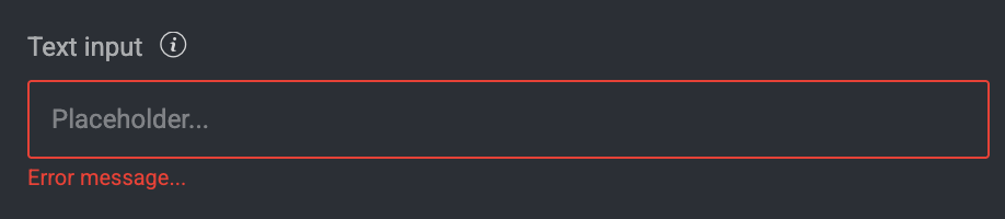
"Components-text": "<details><summary><b>Text Input</b></summary>\n\n<br>\n\n- Type: `text`\n- Properties:\n - All common properties\n - `placeholder` (string): Placeholder text\n - `disabled` (boolean): Whether the field is disabled\n - `errorMessage` (string): Error message to display\n - `numRows` (number): Optionally increase the number of rows displayed\n\n</details>\n\n",
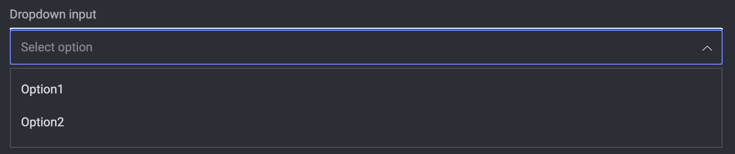
"Components-select": "<details><summary><b>Single Selection - Dropdown</b></summary>\n\n<br>\n\n- Type: `select`\n- Properties:\n - All common properties\n - `options` (array, required): Array of options\n - `label` (string): Display text\n - `value` (any): Option value\n - `disabled` (boolean): Whether the field is disabled\n\n</details>\n\n",
"Components-raido": "<details><summary><b>Single Selection - Radio Buttons</b></summary>\n\n<br>\n\n \n- Type: `radio`\n- Properties:\n - All common properties\n - `options` (array, required): Array of options\n - `label` (string): Display text\n - `value` (any): Option value\n - `disabled` (boolean): Whether the field is disabled\n\n</details>\n\n",
"Components-checkboxes": "<details><summary><b>Multiple Selection - Checkboxes</b></summary>\n\n<br>\n\n\n- Type: `checkbox`\n- Properties:\n - All common properties\n - `options` (array, required): Array of options\n - `label` (string): Display text\n - `value` (any): Option value\n - `disabled` (boolean): Whether the field is disabled\n\n</details>\n\n",
"Components-slider": "<details><summary><b>Number Single Selection - Slider</b></summary>\n\n<br>\n\n\n- Type: `slider`\n- Properties:\n - All common properties\n - `min` (number): Minimum value\n - `max` (number): Maximum value\n - `default` (number): Default value\n - `step` (number): Step increment (minimum 0.01)\n - `disabled` (boolean): Whether the field is disabled\n\n</details>\n\n",
"Components-rating": "<details><summary><b>Number Single Selection - Star Rating</b></summary>\n\n<br>\n\n\n- Type: `rating`\n- Properties:\n - All common properties\n - `maxStars` (number): Maximum number of stars (default: 5; min 1, max 10)\n - `showValue` (boolean): Whether to show numeric value\n\n</details>\n\n",
"Components-image": "<details><summary><b>Image Viewer</b></summary>\n\n<br>\n\n\n- Type: `image`\n- Properties:\n - All common properties\n\n</details>\n\n",
"image": "https://upload.wikimedia.org/wikipedia/en/b/b9/MagrittePipe.jpg",
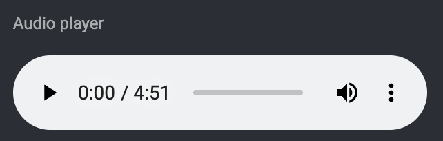
"Components-audio": "<details><summary><b>Audio Viewer</b></summary>\n\n<br>\n\n\n- Type: `audio`\n- Properties:\n - All common properties\n\n</details>\n\n",
"audio": "https://cms-public-artifacts.artlist.io/content/music/aac/958142_Clair_du_Lune_-Debussy-_-_Master_v1_-_No_Bpm_-_020125__-_BOV_-_ORG_-_RMS_-_2444.aac",
"Components-video": "<details><summary><b>Video Viewer</b></summary>\n\n<br>\n\n\n- Type: `video`\n- Properties:\n - All common properties\n\n</details>\n\n",
"video": "https://videos.pexels.com/video-files/856171/856171-hd_1920_1080_30fps.mp4",
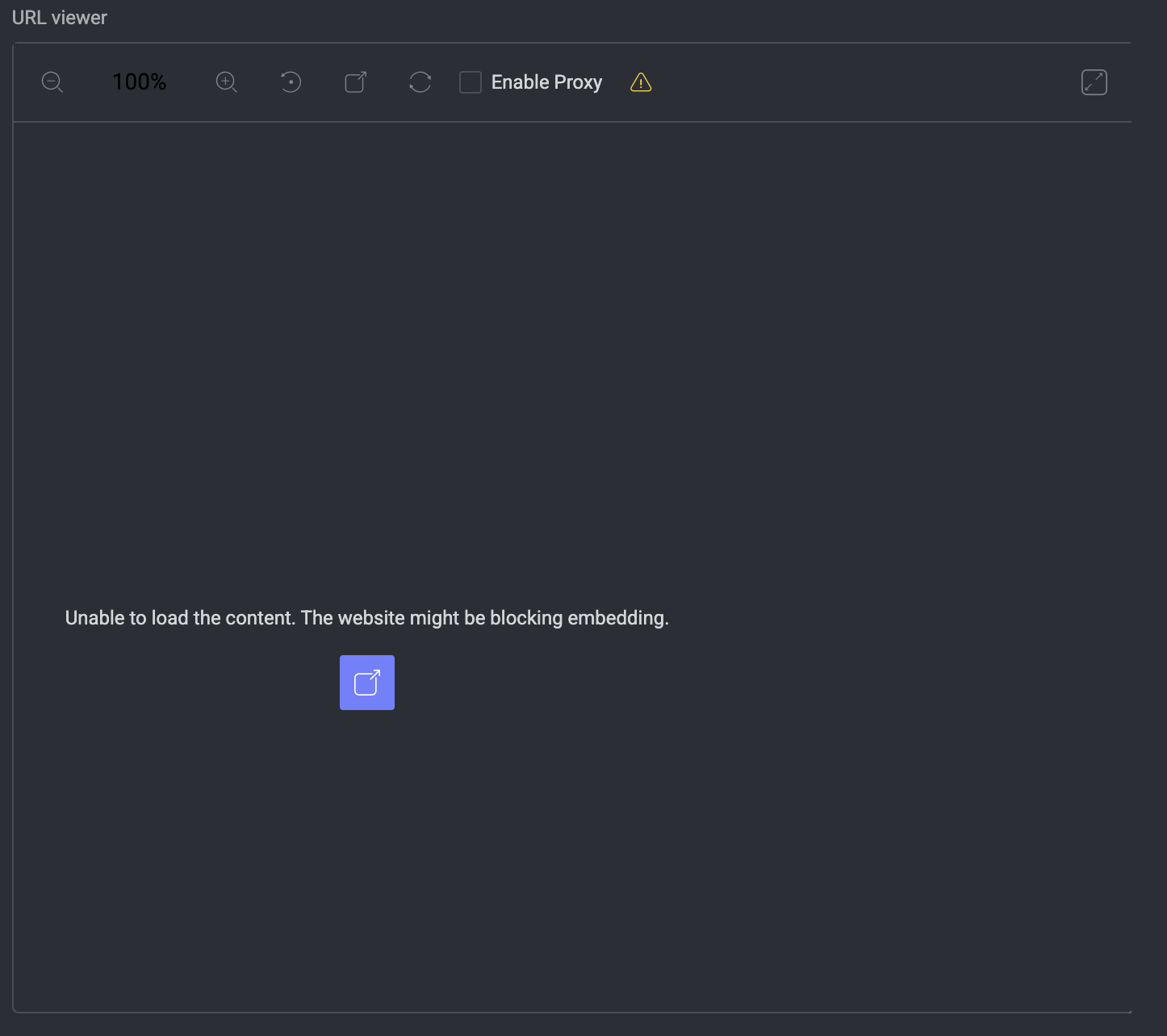
"Components-url": "<details><summary><b>URL Viewer</b></summary>\n\n<br>\n\n\n- Type: `url`\n- Properties:\n - All common properties\n - `initialWidth` (number): Initial iframe width\n - `initialHeight` (number): Initial iframe height\n\n</details>\n\n",
"url": "https://console.dataloop.ai/",
"Components-markdown": "<details><summary><b>Markdown Viewer</b></summary>\n\n<br>\n\n\n- Type: `markdown`\n- Properties:\n - All common properties\n- Insert the markdown text as the value of the markdown component key\n\n*This entire layout is an example*</details>\n\n",
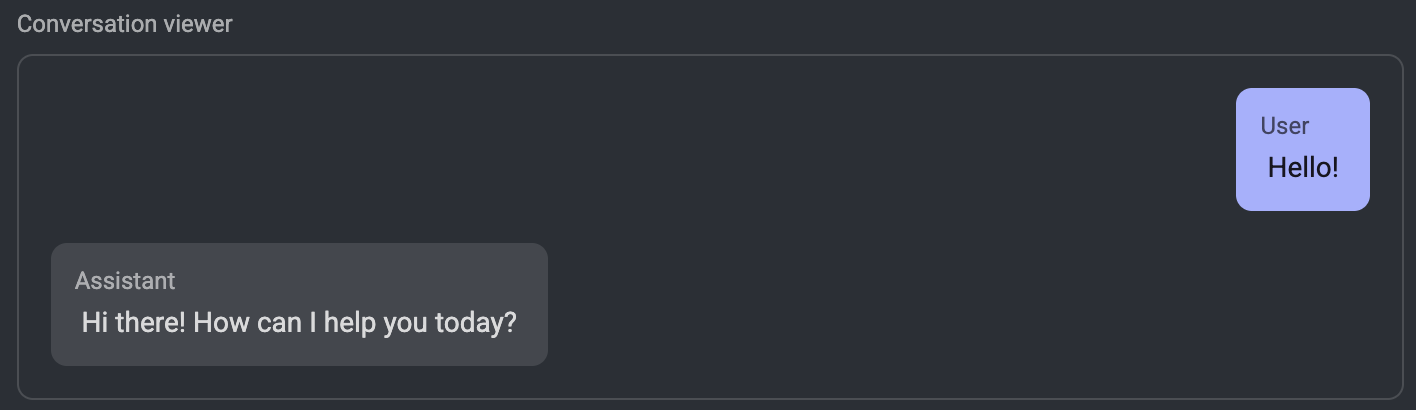
"Components-conversation": "<details><summary><b>Conversation</b></summary>\n\n<br>\n\n\n- Type: `conversation`\n- Properties:\n - All common properties\n- Insert the conversation data as the value of the `convesation` component key, in the form of a JSON object[], and the following fields:\n - `role` (string): Use the word 'user' for the right bubble, or any other string for the left bubble title.\n - `content` (string): The bubble text.\n\n</details>\n\n",
"conversation": [
{
"role": "user",
"content": "Hello!"
},
{
"role": "assistant",
"content": "Hi there! How can I help you today?"
}
],
"Components-condition": "## Visibility Control\n\n\nComponents and sections can be hidden in three ways:\n1. **Direct hiding**: Use the `hidden` property\n```json\n{\n 'type': 'text',\n 'key': 'hiddenField',\n 'hidden': true\n}\n```\n2. **Hierarchical fields**: Make visibility conditional on other field values\n```json\n{\n 'type': 'radio',\n 'key': 'parentField',\n 'options': [\n {\n 'label': 'Click to reveal `childField`',\n 'value': 'true'\n }\n ]\n},\n{\n 'type': 'image',\n 'key': 'childField',\n 'hierarchy': {\n 'condition': { 'parentField': { '$eq': 'true' } }\n }\n}\n```\n\nExample:",
"childField": "https://media1.tenor.com/m/uXZQf0CcrSQAAAAd/tada-ta.gif",
"Components-more-conditions": "<details><summary><b>More Examples</b></summary>\n\n<br>\n\n\n- Show if riddle answer contains 'raven':\n```json\n{\n 'condition': { 'riddle_answer': { '$ilike': '*raven*' } }\n}\n```\n- Use AND logic to show if tea party size is 42 and time is frozen:\n```json\n 'condition': {\n '$and': [\n {\n 'tea_party_size': {\n '$eq': '42'\n }\n },\n {\n 'time_frozen': true\n }\n ]\n }\n```\n- Use OR logic to show if tea party size is 42 or time is frozen:\n```json\n{\n 'condition': {\n '$or': [\n {\n 'tea_party_size': {\n '$eq': '0'\n }\n },\n {\n 'tea_party_size': {\n '$eq': 'infinity'\n }\n }\n ]\n }\n}\n```\n- Use IN logic to show if tea party size is 0, 42 or infinity:\n```json\n{\n 'condition': {\n 'tea_types': {\n '$in': ['earl_grey', 'darjeeling']\n }\n }\n}\n```\n- Use EXISTS logic to show if tea party size is not 0:\n```json\n{\n 'condition': {\n 'riddle_answer': {\n '$exists': true\n }\n }\n}\n```\n- Advance exmaple:\n```json\n{\n 'condition': {\n '$or': [\n {\n '$and': [\n {\n 'tea_party_size': {\n '$eq': '6'\n }\n },\n {\n 'time_frozen': true\n }\n ]\n },\n {\n '$and': [\n {\n 'tea_types': {\n '$in': ['chamomile']\n }\n },\n {\n 'riddle_answer': {\n '$exists': true\n }\n }\n ]\n }\n ]\n }\n}\n```\n3. **Dynamic hiding**: Use JavaScript to control visibility\n```javascript\nmodule.exports = {\n run: async function (formData, formLayout) {\n // Hide field based on some condition\n formLayout[0].components[0].hidden = someCondition;\n return {\n formData,\n formLayout,\n };\n },\n};\n```\n</details>\n\n",
"js-css": " ## JavaScript and CSS for Dynamic Behavior\n<details><summary><b>JavaScript Module</b></summary>\n\n<br>\n\n\nAdd custom validation and dynamic behavior by providing a JavaScript module:\n```javascript\n// Define your 'run' function here\nfunction run (formData, formLayout) {\n // This function will be called when form values change\n // formData: the data that is set on the form\n // formLayout: the layout of the form, you can change the layout to show error messages or other ui elements\n // Set an error message on the component if the name is too long\n if (formData.text2.length > 5) {\n formLayout[0].components[30].errorMessage = `The name is too long, Max 5 characters. ${formData.text2.length}/5`;\n window.dl.sendEvent({\n name: 'app:toastMessage',\n payload: {\n 'type': 'info', // info, error, warning, success\n 'message': 'The name is too long...'\n },\n });\n }\n else {\n formLayout[0].components[30].errorMessage = ''\n }\n // Log the form data to the console\n console.log('Consoling from the JS code');\n\n // Return the form layout and data\n return { formLayout, formData };\n}\n\n// Export the run function\nmodule.exports = {run};\n```\n</details>\n\n<details><summary><b>Custom CSS</b></summary>\n\n<br>\n\n\nAdd custom styling by providing CSS:\n```css\n.form-section {\n /* Custom section styling */\n}\n\n.field-container {\n /* Custom field styling */\n}\n\n.field-text2 {\n width: 250px;\n}\n```\nTry It:</details>\n\n",
"end": "---\n *Find more examples in our Template Library*."
}JavaScript
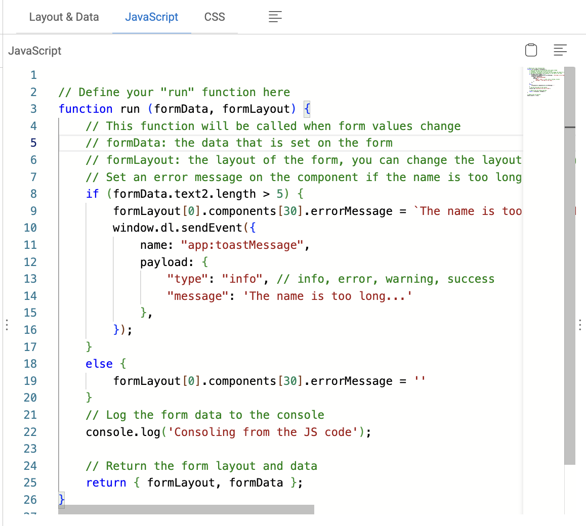
In the GenAI / Multimodal Recipe of the DDOE platform, the JavaScript section plays a powerful and flexible role—especially in the context of the GenAI Evaluation Studio. This capability allows teams to extend form behaviors and interactivity with custom logic directly embedded in the recipe layout.
The JavaScript section enables dynamic customization of the annotation interface by providing a run() function that the DDOE system executes each time:
Form data is changed by the annotator
The form is initialized or updated
Custom logic needs to react to user input
This allows you to enforce validation, transform layout, and communicate with the platform, all in real-time.
Use cases
1. Custom Validation
You can check user input and set error messages dynamically:
// 🔍 Check if the 'username' field in the form has less than 10 characters
if (formData.username.length < 10) {

    // ⚠️ If the condition is true, set a validation error message on the first component
    // in the first form layout block
    formLayout[0].components[0].errorMessage = 'Username too short';
}
2. Dynamic UI Feedback
You can display real-time feedback using platform-integrated mechanisms like toast notifications:
// 🔔 Trigger a toast notification in the Dataloop UI
window.dl.sendEvent({
  // Name of the built-in event that shows a toast
  name: 'app:toastMessage',

  // Data payload passed to the event handler
  payload: {
    type: 'info',             // Toast category: 'info' | 'success' | 'warning' | 'error'
    message: 'Input received!' // Text that will appear in the toast banner
  }
});
3. Conditional UI Modification
You can show/hide fields, change values, or even inject new UI components based on logic:
// Check if the 'enableAdvanced' field in the form data is set to true
if (formData.enableAdvanced === true) {

    // If true, make the second component (index 1) inside the third form section (index 2) visible
    formLayout[2].components[1].visible = true;
}
Platform Integration Capabilities
This JavaScript block isn’t sandboxed in isolation—it has access to the broader DDOE context through:
window.dl.sendEvent(...)to emit internal UI events (like messages)formLayoutupdates to visually reflect logicReusable patterns to enforce consistency across annotation projects
CSS
In the GenAI / Multimodal Recipe of the DDOE platform, the CSS section is a styling layer that empowers you to fully customize the appearance of the annotation interface—specifically within the GenAI Evaluation Studio. This feature is designed to give you fine-grained control over the UI, helping to create a tailored and branded experience for evaluators, streamline usability, and improve cognitive focus for annotators working on complex GenAI outputs.
The CSS section allows you to inject custom styles into your recipe layout. This means you can override default component styles or add entirely new visual styles for specific annotation tasks.
By leveraging CSS, you can:
Highlight critical fields
Hide or dim less important UI elements
Enforce brand consistency
Improve readability for specific data types
Visually separate input/output sections
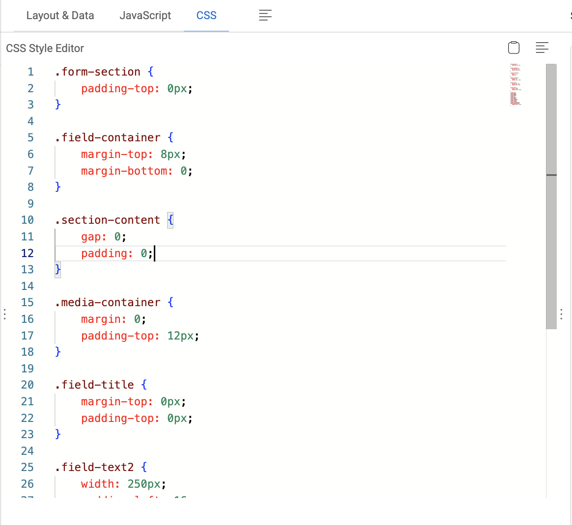
For example,
/* Set a fixed width of 200px for the form field with class 'field-chat_b' */
.field-chat_b {
    width: 200px;
}

/* Set a fixed width of 200px for the form field with class 'field-chat_a' */
.field-chat_a {
    width: 200px;
}

/* Style the title field:
   - Font size set to 16px
   - Font weight medium (500)
   - Light gray color for text
   - !important ensures these styles override any default styles
*/
.field-title {
    font-size: 16px !important;
    font-weight: 500 !important;
    color: #f5f2f2 !important;
}

/* Apply a full width (100%) to all elements whose class starts with 'field-' */
[class^="field-"] {
    width: 100%;
}
Studio Preview
In the GenAI / Multimodal Recipe of the DDOE platform, the Studio Preview section is an essential visual interface for developing and validating your GenAI Evaluation Studio workflows. It allows users to interactively inspect and test how the annotation UI will look and behave before publishing it to production.
The Studio Preview is designed to:
Visualize your current layout configuration
Simulate the actual user experience during annotation
Test the integration of Sample Data and JavaScript logic
Catch design or usability issues early.
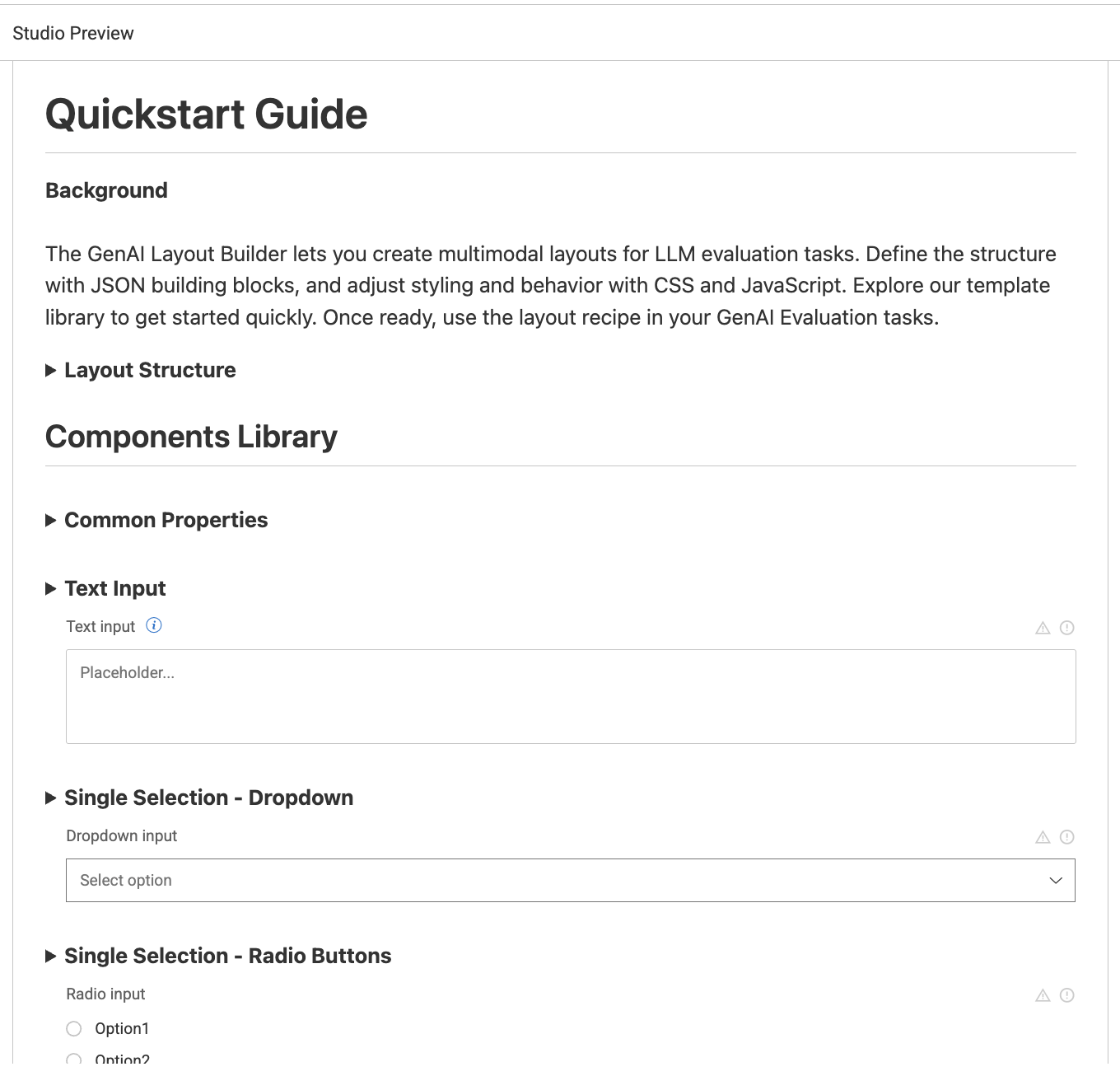
Components Library
The Components Library in the GenAI Multimodal Recipe of the DDOE platform provides a set of configurable UI building blocks that are used to construct custom annotation interfaces in the GenAI Evaluation Studio. These components define the structure, functionality, and user experience of your annotation forms, enabling teams to design interfaces that match the logic and modality of any GenAI evaluation task—text, image, audio, video, chat, or multimodal combinations.
Each of these components is placed within layout sections, which are then displayed in the Studio Preview. You can combine multiple components to build:
A/B evaluations of generated content
Chat comparisons
Content classification or rating tasks
Image or audio-based grounding evaluations
Multi-field scoring forms
They work seamlessly with:
JavaScript logic (for dynamic behavior)
CSS styling (for UI customization)
Sample Data (for simulated previews)
All components support these base properties:
Property | Type | Required | Description |
|---|---|---|---|
|
| ✅ | Unique identifier for the component, used to reference it in |
|
| ✅ | Defines the component type (e.g., |
|
| ❌ | Label or title shown to the user above the field |
|
| ❌ | Help text shown on hover (useful for annotator guidance) |
|
| ❌ | Whether the field should be hidden from the view |
|
| ❌ | Marks the field as required before submission |
|
| ❌ | Logic rules that control conditional visibility of this component |
|
| ❌ | A DQL (DDOE Query Language) expression to trigger visibility or logic |
Title
Property | Type | Required | Description |
|---|---|---|---|
All common properties | - | - | - |
|
| ❌ | Placeholder or help text |
Text Input
Property | Type - | Required | Description |
|---|---|---|---|
All common properties | - | - | - |
|
| ❌ | Placeholder text |
|
| ❌ | If true, the field is not editable |
|
| ❌ | Message shown on validation error |
Single Selection - Dropdown
Property | Type - | Required | Description |
|---|---|---|---|
All common properties | - | - | - |
|
| ✅ | List of choices |
|
| ❌ | Display text for each option |
|
| ❌ | The internal value for each option |
|
| ❌ | Whether the field is disabled |
Single Selection - Radio Buttons
Property | Type: | Required | Description |
|---|---|---|---|
All common properties | - | - | - |
|
| ✅ | Array of radio button choices |
|
| ❌ | Display text for each choice |
|
| ❌ | Internal value for selected option |
|
| ❌ | Whether the field is disabled |
Multiple Selection - Checkboxes
Property | Type - | Required | Description |
|---|---|---|---|
All common properties | - | - | - |
|
| ✅ | Array of checkbox choices |
|
| ❌ | Display text for each choice |
|
| ❌ | Value(s) selected |
|
| ❌ | Whether the field is disabled |
Number Single Selection - Slider
Property | Type - | Required | Description |
|---|---|---|---|
All common properties | - | - | - |
|
| ❌ | Minimum value |
|
| ❌ | Maximum value |
|
| ❌ | Initial/default slider position |
|
| ❌ | Increment between values |
|
| ❌ | Whether the slider is disabled |
Number Single Selection - Star Rating
Property | Type - | Required | Description |
|---|---|---|---|
All common properties | - | - | - |
|
| ❌ | Maximum number of stars (default: 5) |
|
| ❌ | Show numeric value next to stars |

Image Viewer
Type:
imageProperties:
All common properties

Audio Viewer
Type:
audioProperties:
All common properties
Video Viewer
Type:
videoProperties:
All common properties

URL Viewer
Property | Type - | Required | Description |
|---|---|---|---|
All common properties | - | - | - |
|
| ❌ | Width of the embedded iframe |
|
| ❌ | Height of the embedded iframe |
Markdown Viewer
Type:
markdownProperties:
All common properties
Insert the markdown text as the value of the markdown component key.
Conversation
Insert the conversation data as the value of the convesation component key, in the form of a JSON object[], and the following fields:
Property | Type - | Required | Description |
|---|---|---|---|
All common properties | - | - | - |
|
| ❌ | Use the word ‘user’ for the right bubble, or any other string for the left bubble title. |
|
| ❌ | The bubble text. |
Templates Library
Let’s go a bit deeper into the most common built-in templates with examples available in the Library. There are two categories of recipes available:
DDOE: The list of available recipe templates by default.
Project: The list of recipes created and available in your project.
Start using one of the template by selecting it and clicking on the Use Layout. To customize the template, refer to the Componets Library and use them as required.
Compare Conversations
A layout designed to compare and analyze multiple conversations or text entries side by side. Compare two or more LLM responses side-by-side for quality, coherence, or factual accuracy.
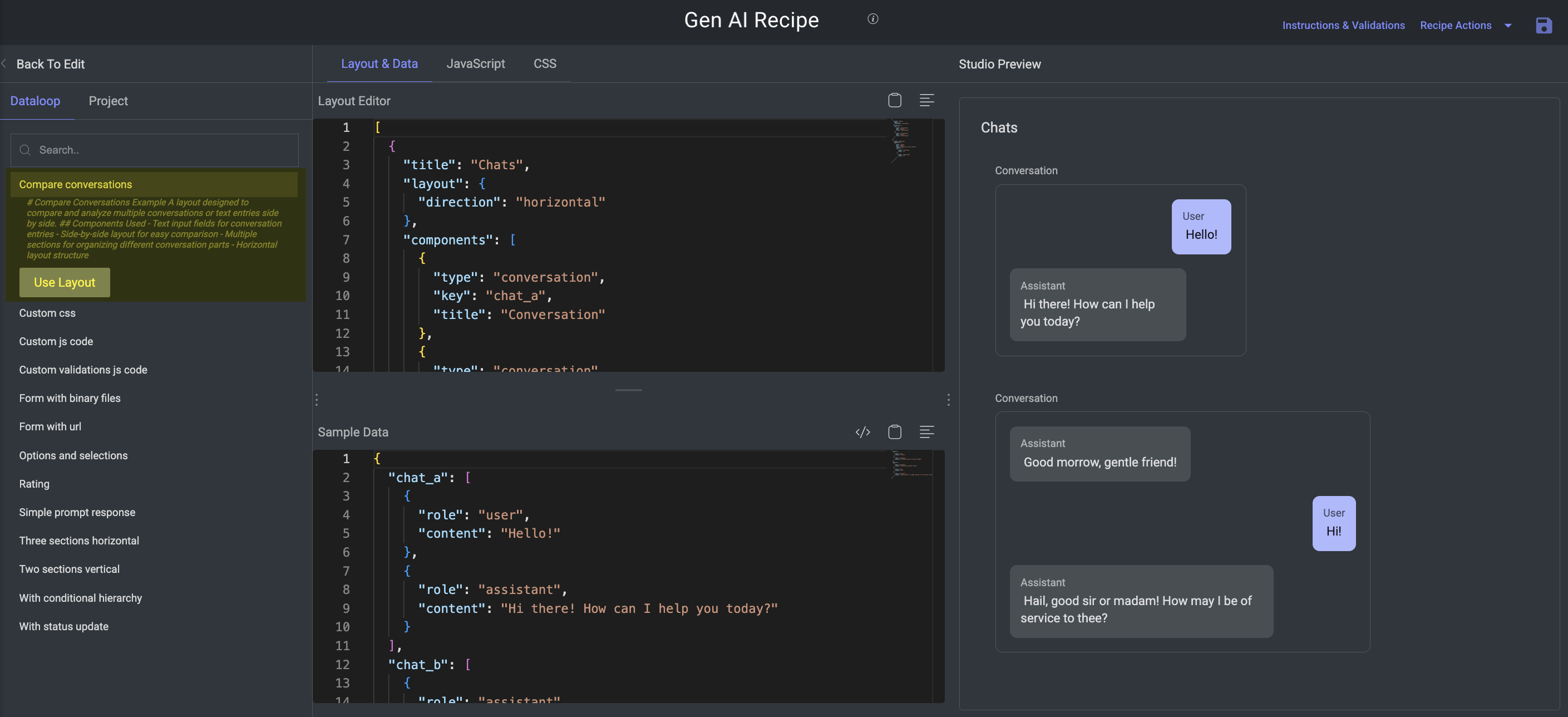
Components:
Text input fields for conversation entries
Side-by-side layout for easy comparison
Multiple sections for organizing different conversation parts
Horizontal layout structure.
Custom CSS
Purpose: Showcase how to fully customize the visual design of your evaluation forms using CSS.
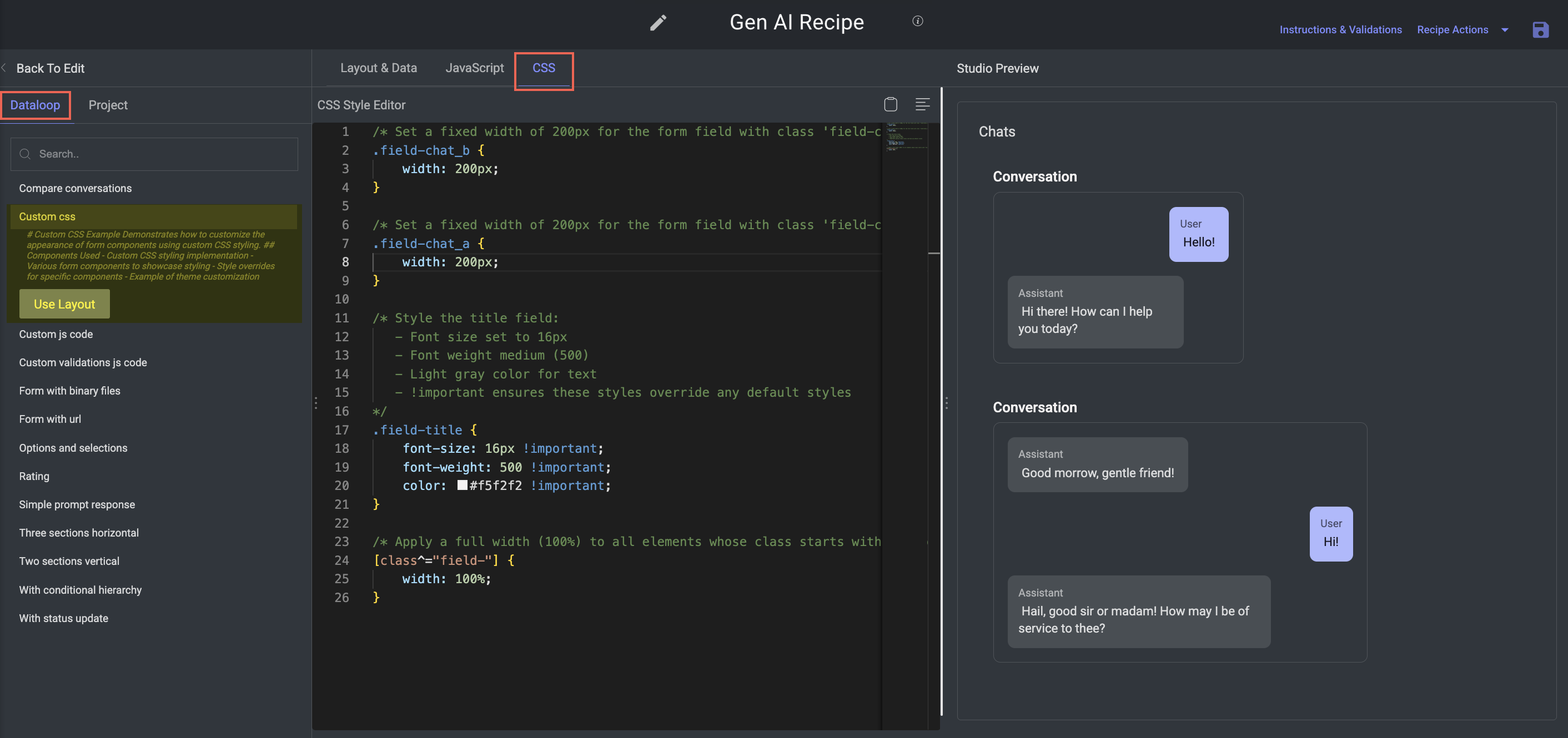
Key Features:
Tailors the form’s appearance using embedded CSS styles.
Helps apply consistent theming and branding across components.
Components:
Standard input components:
text,select, andcheckbox.Custom CSS styling for:
Theme colors (e.g., background, buttons, font)
Font styles (e.g., size, weight, family)
Component resizing (e.g., field widths, paddings)
Layout tweaks (e.g., spacing, alignment, positioning)
Custom JavaScript Code
Purpose: Demonstrate how to add advanced interactivity and validation logic to forms using custom JavaScript.
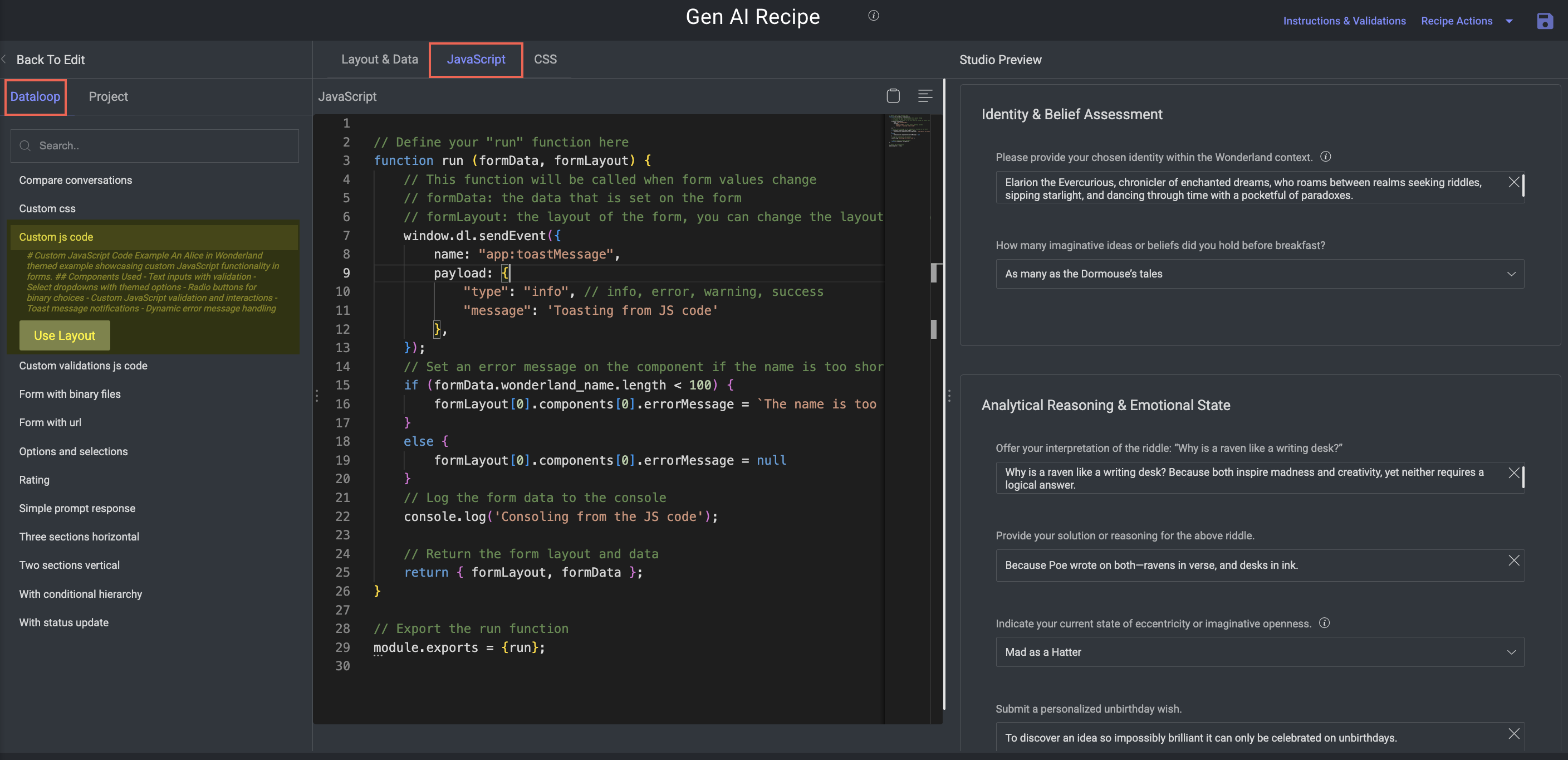
Key Features:
Enables real-time form behavior, conditionally interactive elements, and UI alerts.
Components:
Text inputs with live validation.
Select dropdowns with themed/predefined options.
Radio buttons for binary decisions.
Custom JS logic for:
Real-time validation
Dynamic error messages
Toast notifications (info/success/warning)
Interactive logic, e.g., show/hide based on other inputs
Example Behavior: Show/hide fields based on previous answers (e.g., enable advanced options only if a checkbox is selected).
Custom Validation JavaScript Code
Purpose: Focused example of using JavaScript purely for validation logic.
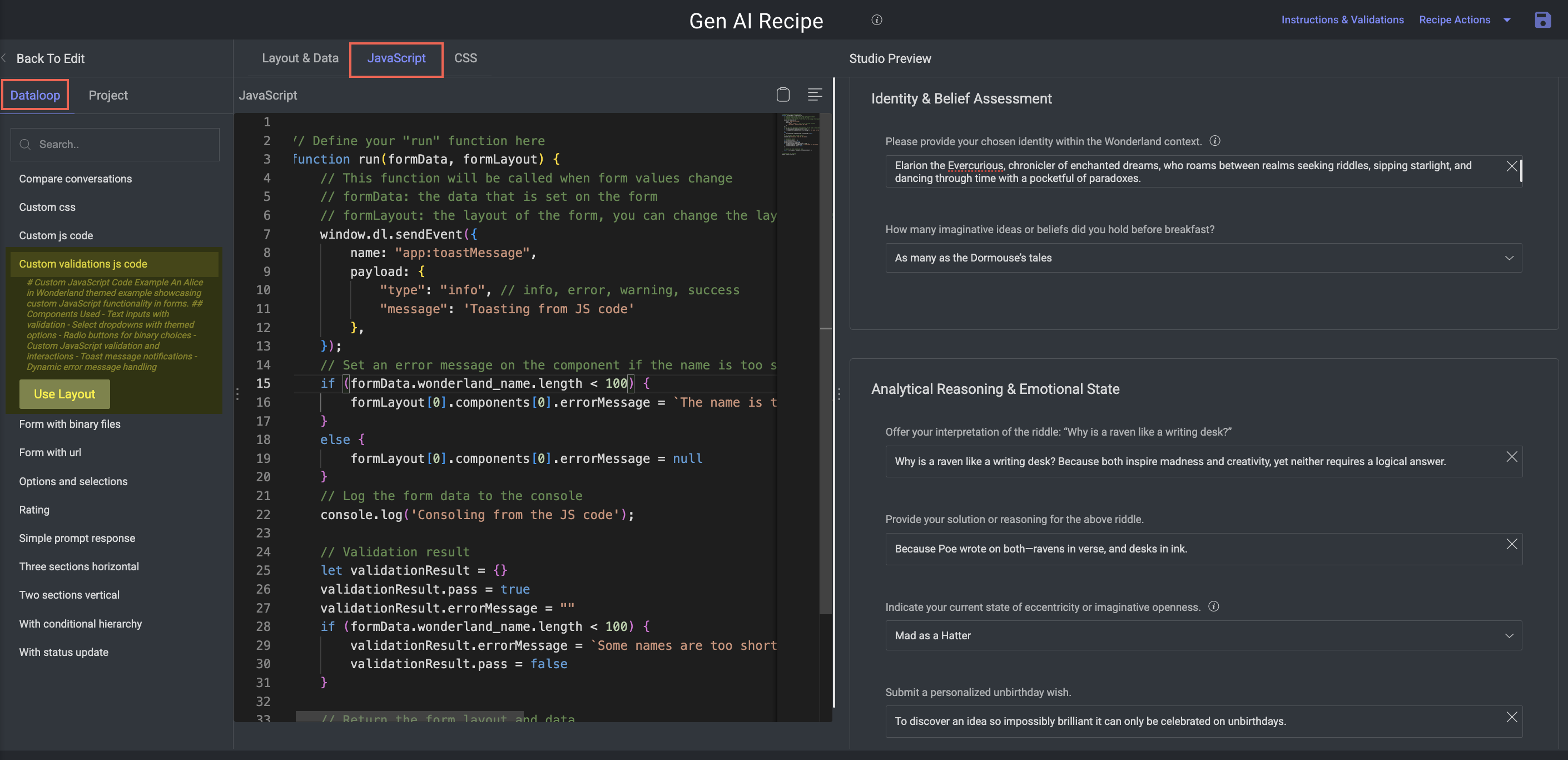
Key Features:
Demonstrates complex rule enforcement to ensure high-quality input before submission.
Components:
Multiple text fields and dropdowns with interdependent validation.
Pass/fail logic written in JavaScript.
Dynamic error messages based on input state.
Submission is blocked until all validations are satisfied.
Form with Binary Files
Purpose: Illustrates how to support uploading and validating binary content (media files) in forms.
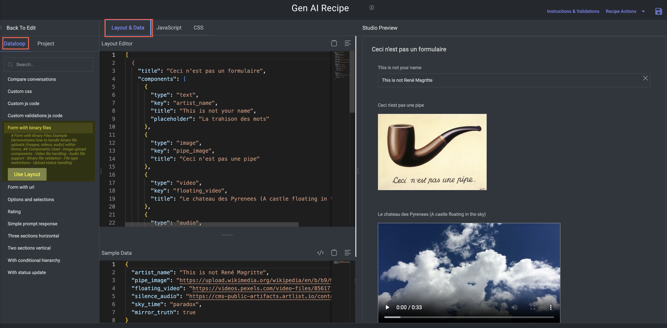
Key Features:
Ideal for image generation, multimodal output, or voice model evaluation tasks.
Components:
Image uploader
Audio/video file uploader
Built-in validations:
File format restrictions
Max file size
Upload tracking with progress indicators and status feedback
Form with URL
Purpose: Demonstrates how to evaluate or extract information from user-provided URLs.
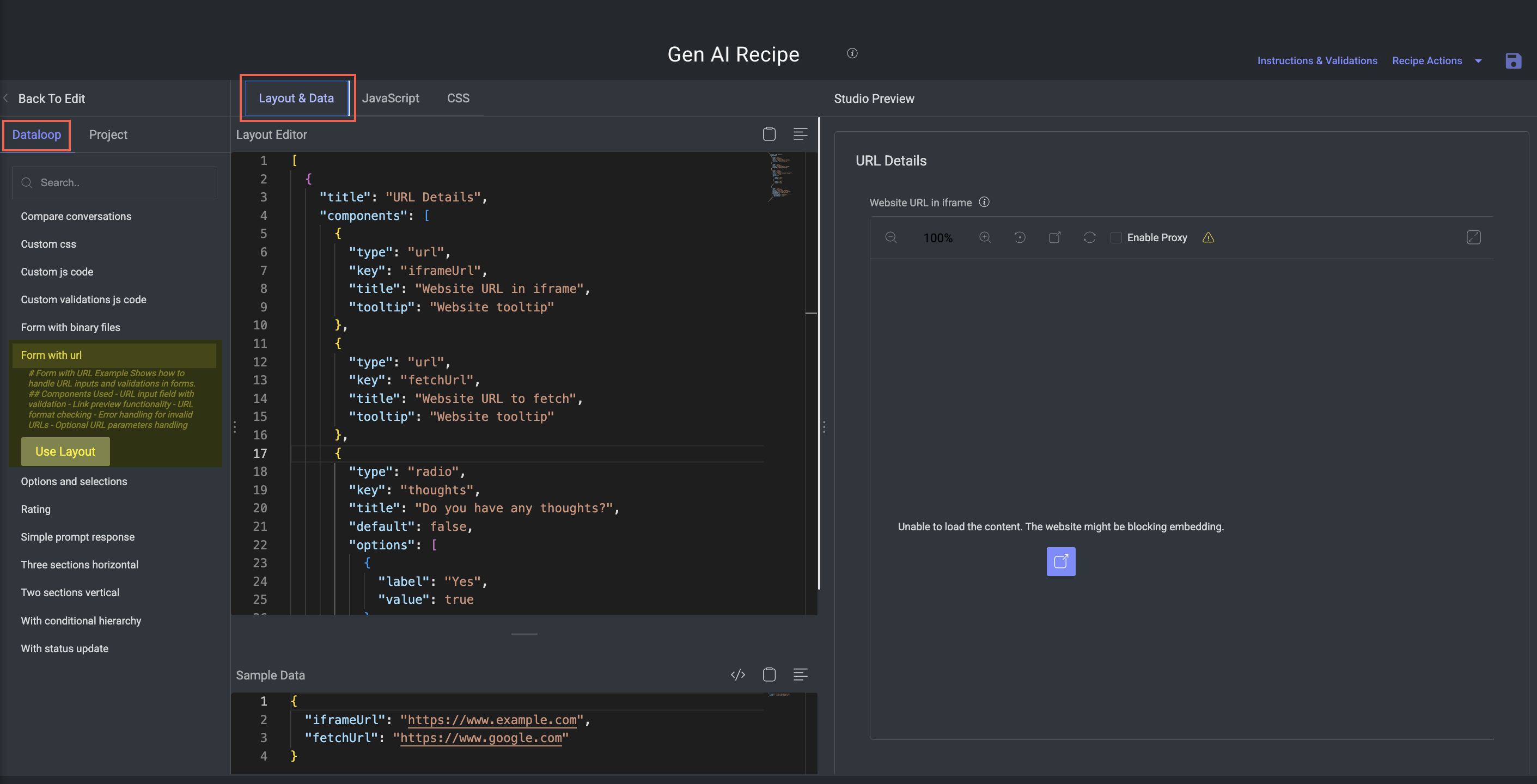
Key Features:
Useful for tasks involving external content, links to hosted outputs, or web-based tools.
Components:
URL input field with validation
Live link previews
Invalid URL detection with error messaging
Optional: parse query parameters from the URL for evaluation metadata
Options and Selections
Purpose: Present standard multiple choice selection mechanisms.
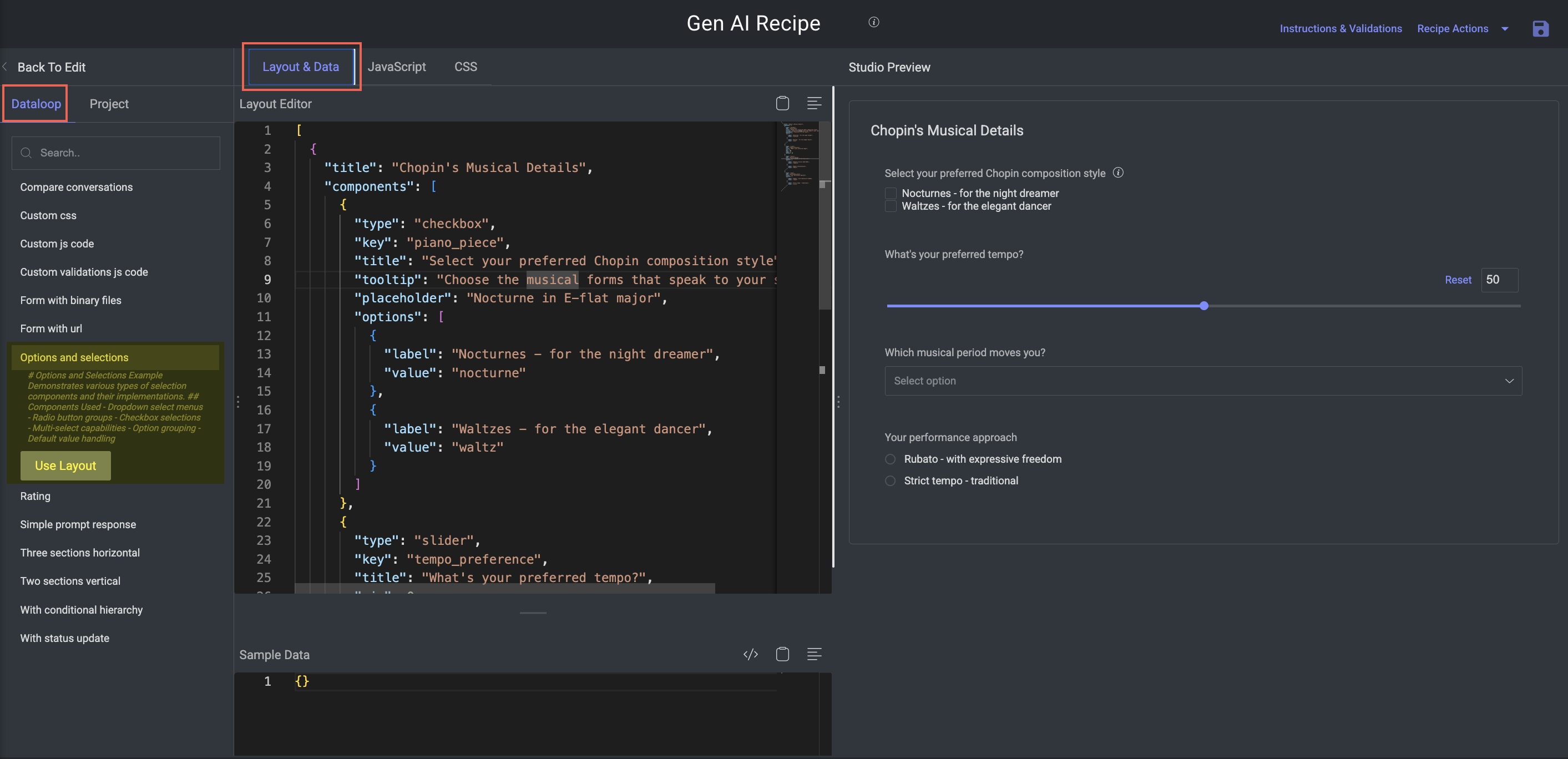
Key Features:
Commonly used in classification, preference ranking, or attribute tagging.
Components:
Dropdown menus (single select)
Radio button groups (mutually exclusive)
Checkbox groups (multi-select)
Default option settings
Grouped/structured option sets for better UX
Rating
Purpose: Collect quantitative and qualitative feedback using rating components.
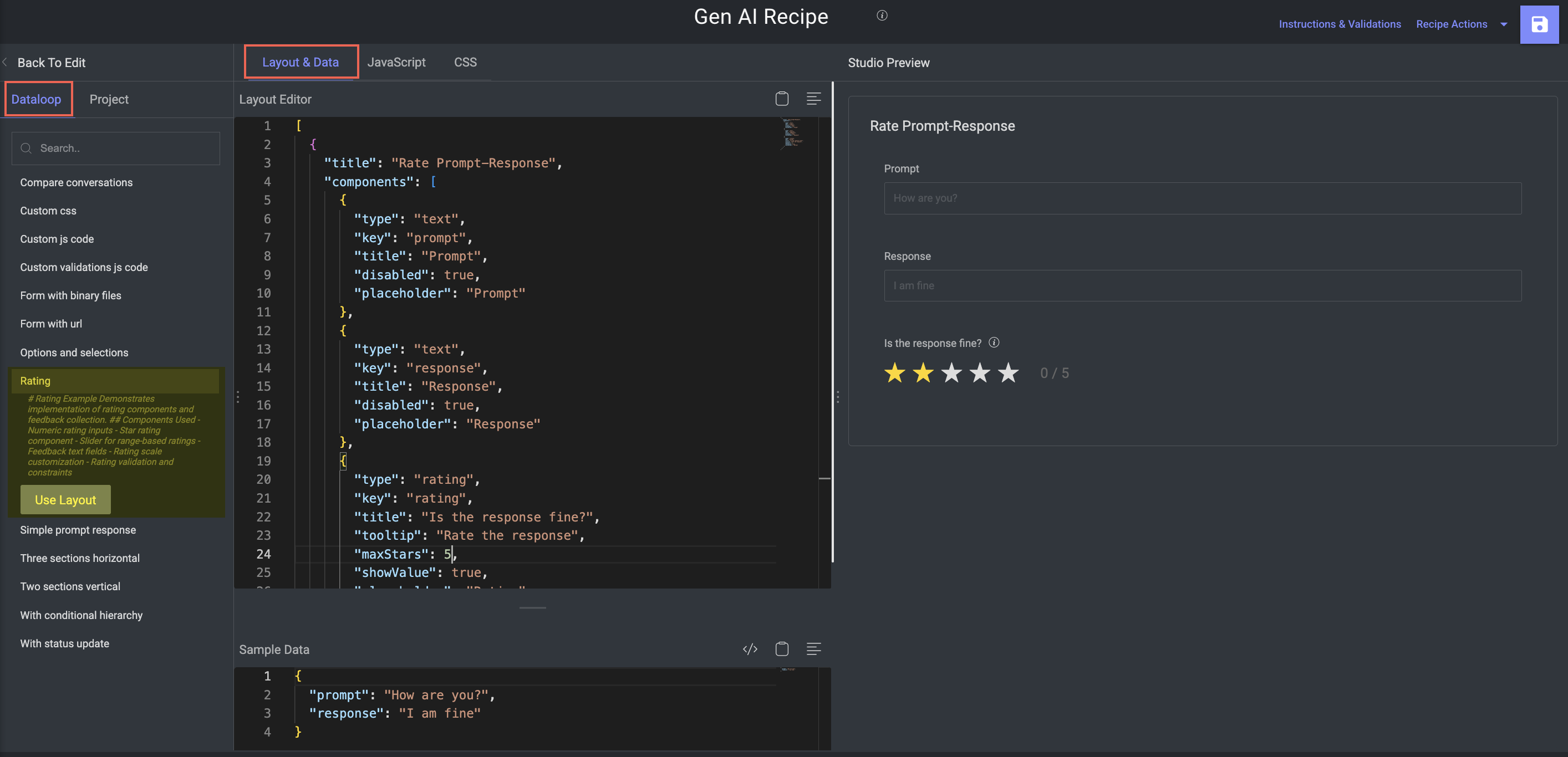
Key Features:
Used in model evaluation tasks like fluency, relevance, and safety scoring.
Components:
Star rating systems (1–5 or custom)
Numeric input fields for scores
Slider components for continuous ratings
Linked feedback text boxes
Min/max validation for scoring consistency
Simple Prompt Response
Purpose: Minimal example for evaluating prompt/response pairs.
.png)
Key Features:
Ideal for quick testing, dataset reviews, or basic output assessment.
Components:
Text input for the prompt
Text input for the model’s response
Clean layout with minimal validation
Three Sections Horizontal
Purpose: Compare three parallel outputs or inputs side-by-side in a single view.
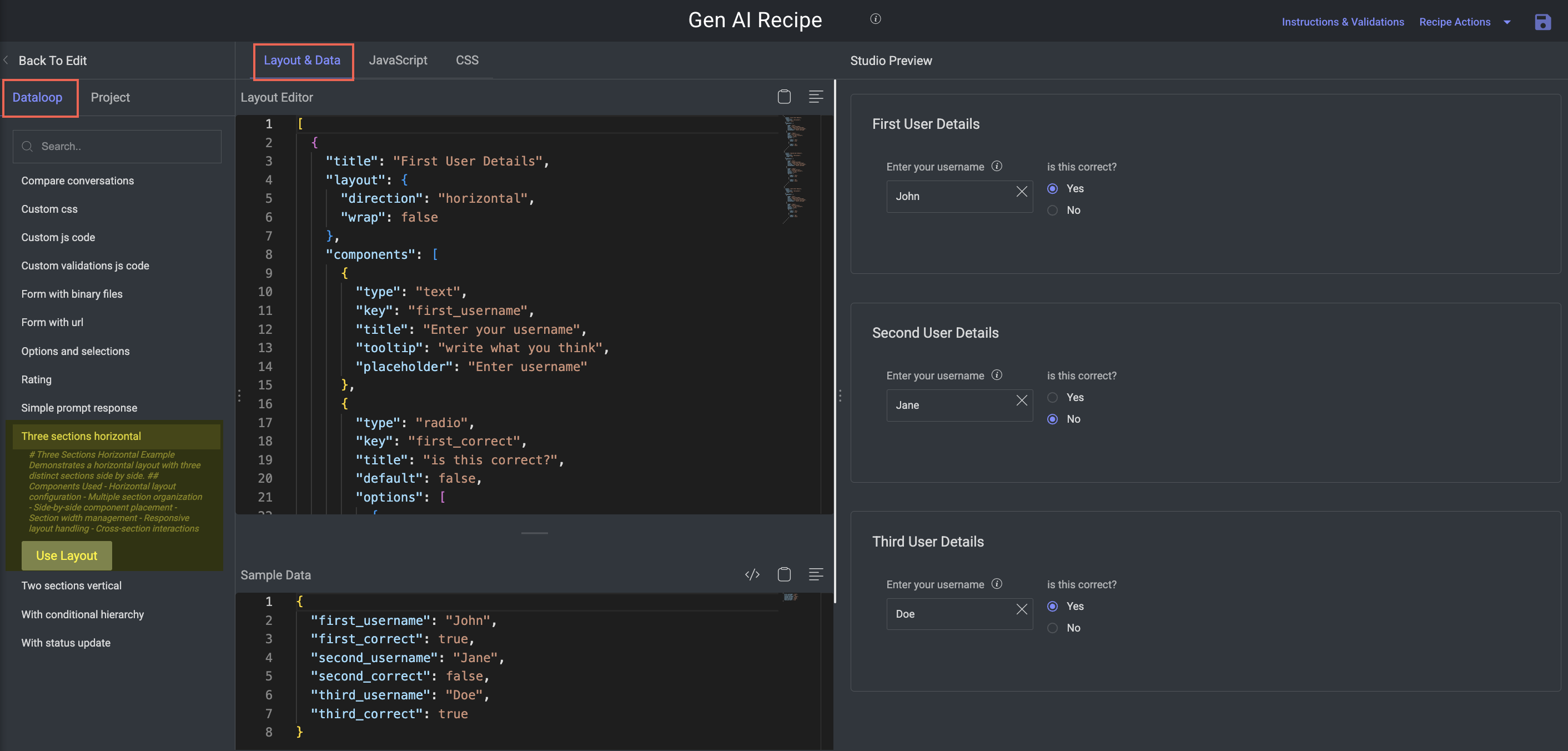
Key Features:
Great for comparing chatbot responses, image generations, or translated outputs.
Components:
Three horizontally laid-out sections
Equal column widths with responsive resizing
Optional interdependencies between sections
Two Sections Vertical
Purpose: Stack two sections vertically for a cleaner, linear annotation workflow.
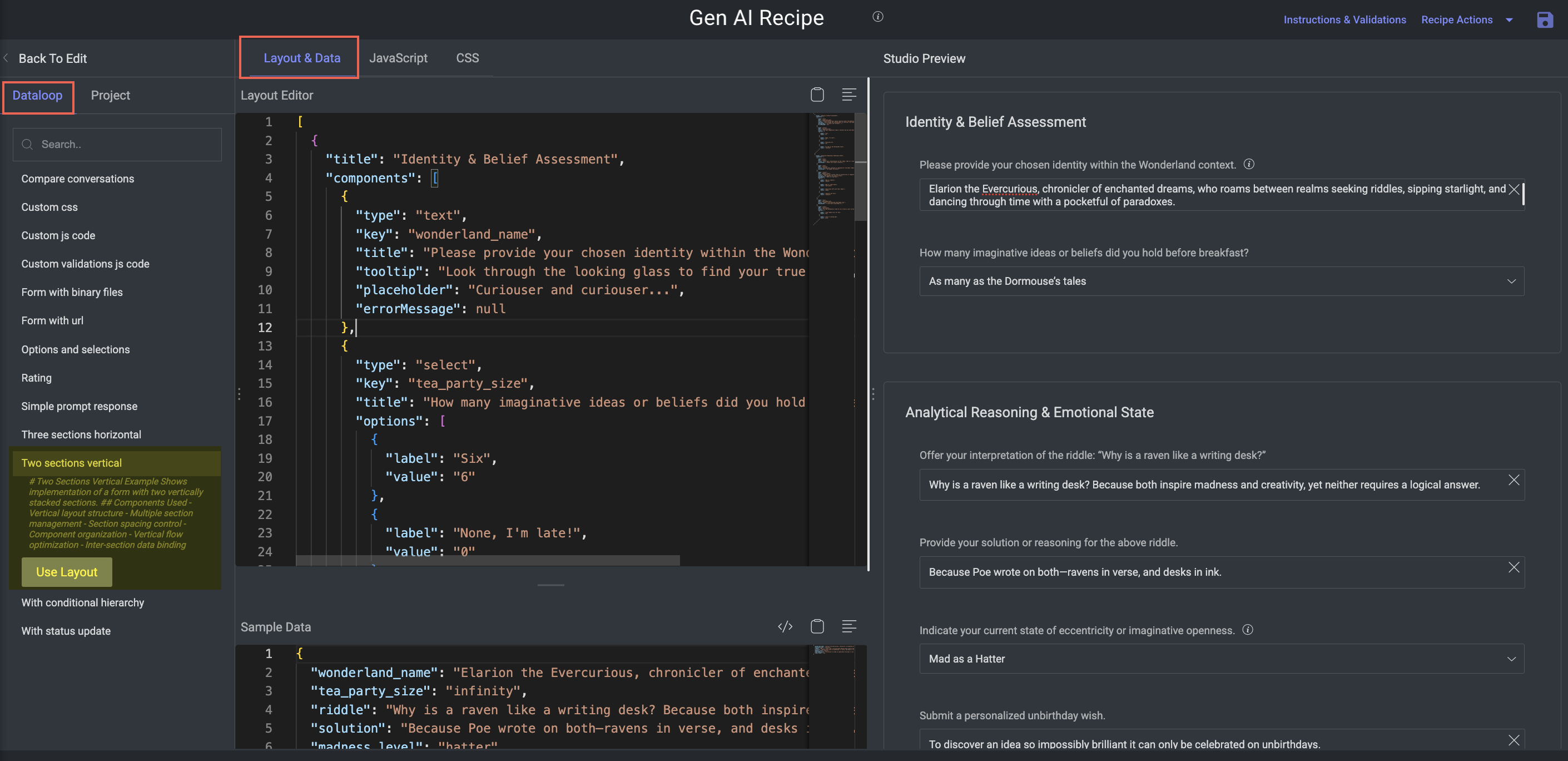
Key Features:
Simpler structure suited for prompt + output, before/after, or Q&A formats.
Components:
Vertically stacked layout
Logical separation between top/bottom sections
Controlled spacing for readability
With Conditional Hierarchy
Purpose: Show how to dynamically control form visibility based on input values.
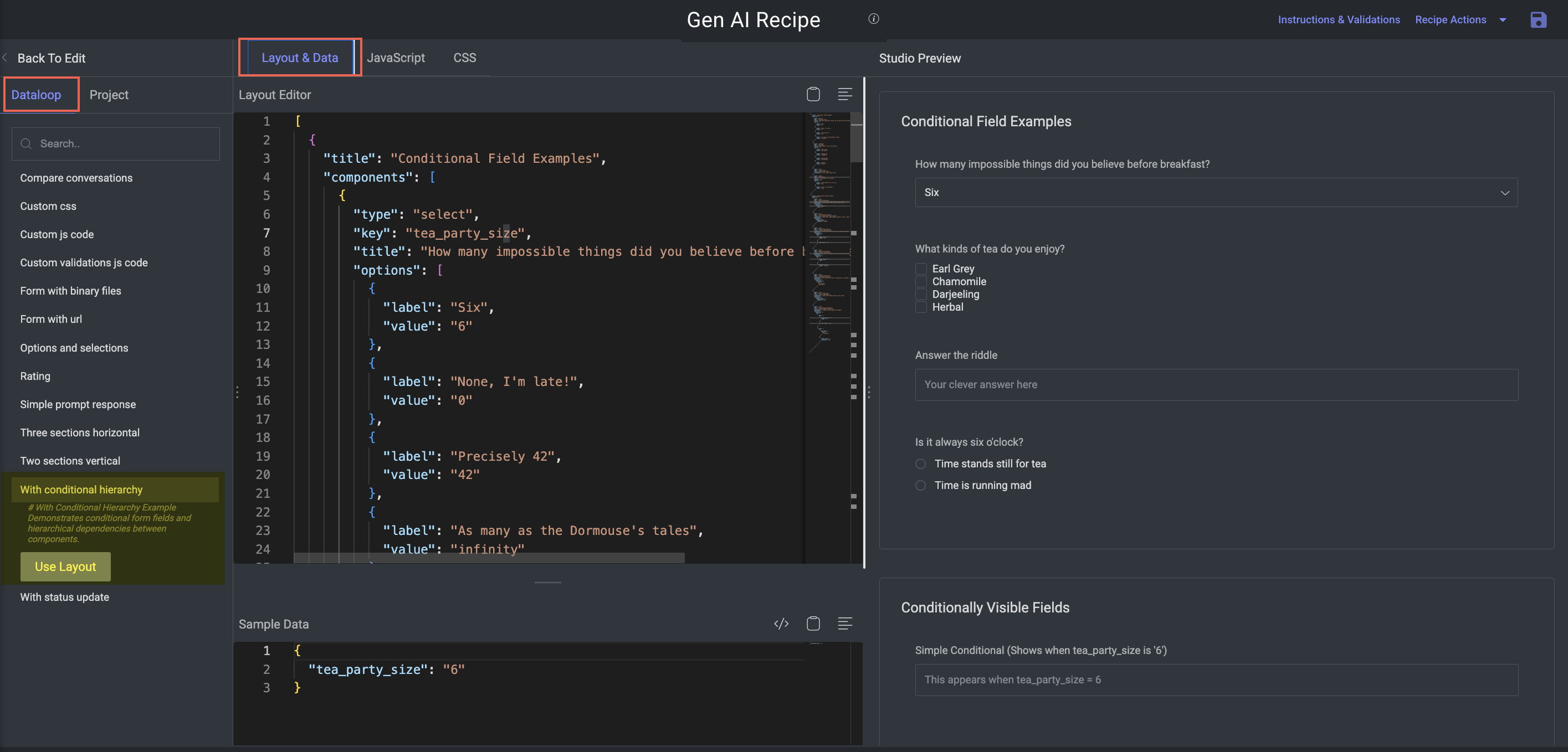
Key Features:
Powerful for adaptive forms, such as enabling advanced settings conditionally.
Components:
Hierarchical logic using
hierarchyorconditionfieldsSupports logical operators:
AND,OR,IN,EXISTS, etc.Multi-level visibility rules (e.g., show fields only if several conditions are met)
With Status Update
Purpose: Demonstrates state tracking and progress management within the form.
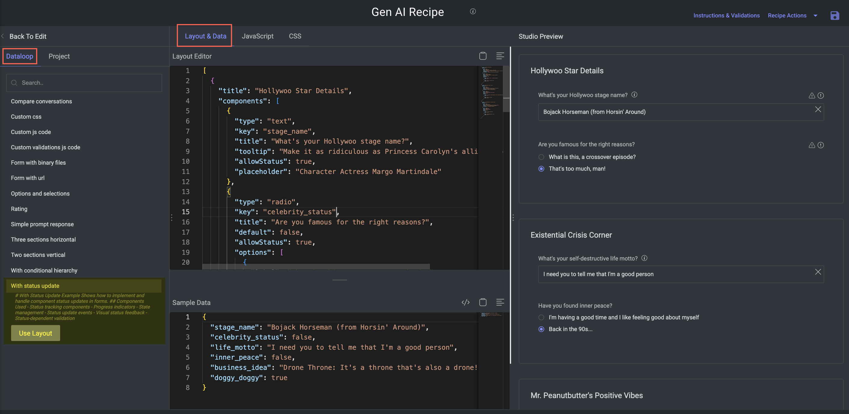
Key Features:
Enables interactive workflows where the status changes based on annotator inputs or stages.
Components:
Fields for status labels or dropdowns
Progress indicators or step-based feedback
Event-triggered status changes
Visual cues for "in progress", "complete", "needs review", etc.
Create Unique GenAI Evaluation Recipes
A fully customizable, multimodal evaluation layout that lets annotators provide feedback on AI-generated content. Designed for building a studio layout entirely from scratch.
1. Open the Recipe menu
Open Recipes from the left-hand navigation panel.
Click Create Recipe to bring up the configuration dialog.
Choose the GenAI / Multimodal. An annotation tasks type selection window appears.
Choose the Unique GenAI Evaluation option from the list.
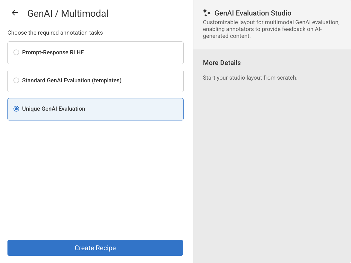
Click Create Recipe. The Layout & Data tab is opened, and you can start customizing layout as per the requirement. Learn more about the customization.