Overview
Gain insights into annotation quality and performance using DDOE’s Score Analytics. Learn how to interpret scoring data, identify issues, and optimize QA workflows through detailed visual metrics and analytics tools.
The analytics score dashboard displays the score information in the respective context:
Consensus Task: The consensus or agreement in the task for all annotations.
Qualification Task: The individual annotator score vs. ground truth.
Honeypot Task: See the quality scores for an annotator in a task for honeypot items having ground truth.
When running Consensus, Qualification, or Honeypot tasks with a score function enabled, each completed item is processed by the function to generate a corresponding score.
Score Function
DDOE’s default score function is documented here. You can fully customize it to suit your QA needs by:
Forking the existing function.
Modifying the code to apply your custom logic.
Installing it as a separate application.
Integrating it into your pipeline to replace the default scoring behavior.
This allows you to tailor the scoring process based on project-specific requirements.
Missing Data in the Score Tab
Incomplete Tasks: The score tab will remain empty if none of the associated tasks have been completed.
Scoring Pipeline Failure: If the pipeline responsible for running the scoring function encounters an error, the platform will be unable to display scoring data.
Example: A corrupted item (e.g., a video file where the duration does not match the number of frames) may cause the pipeline to fail.
Task Type or Missing Score Function: The score tab is only available for quality tasks that include a defined scoring function. It will not appear for other task types such as consensus, honeypot, or qualification, or when a score function is not assigned.
Metrics
![]()
Assignees: Number of users assigned to the consensus, qualification, or honeypot task. In consensus tasks, not all users in the task necessarily work on consensus items.
Items: Number of consensus, qualification, or honeypot items. In consensus and honeypot tasks, not all items in the task are necessarily used for quality control.
Annotations: Number of annotations from all users, created in consensus, qualification, or honeypot items.
Average Geometry Score: Average score between all annotations' geometry (Intersection Over Union for box or polygon annotations, and distance for point annotations).
Avg. Labels Consensus: Average annotation-label consensus between annotations. Label agreement is either 0 or 1.
Graphs
Graphs related to annotation labeling on datasets are crucial for visualizing and assessing the quality and effectiveness of the annotation process in machine learning and data science projects.
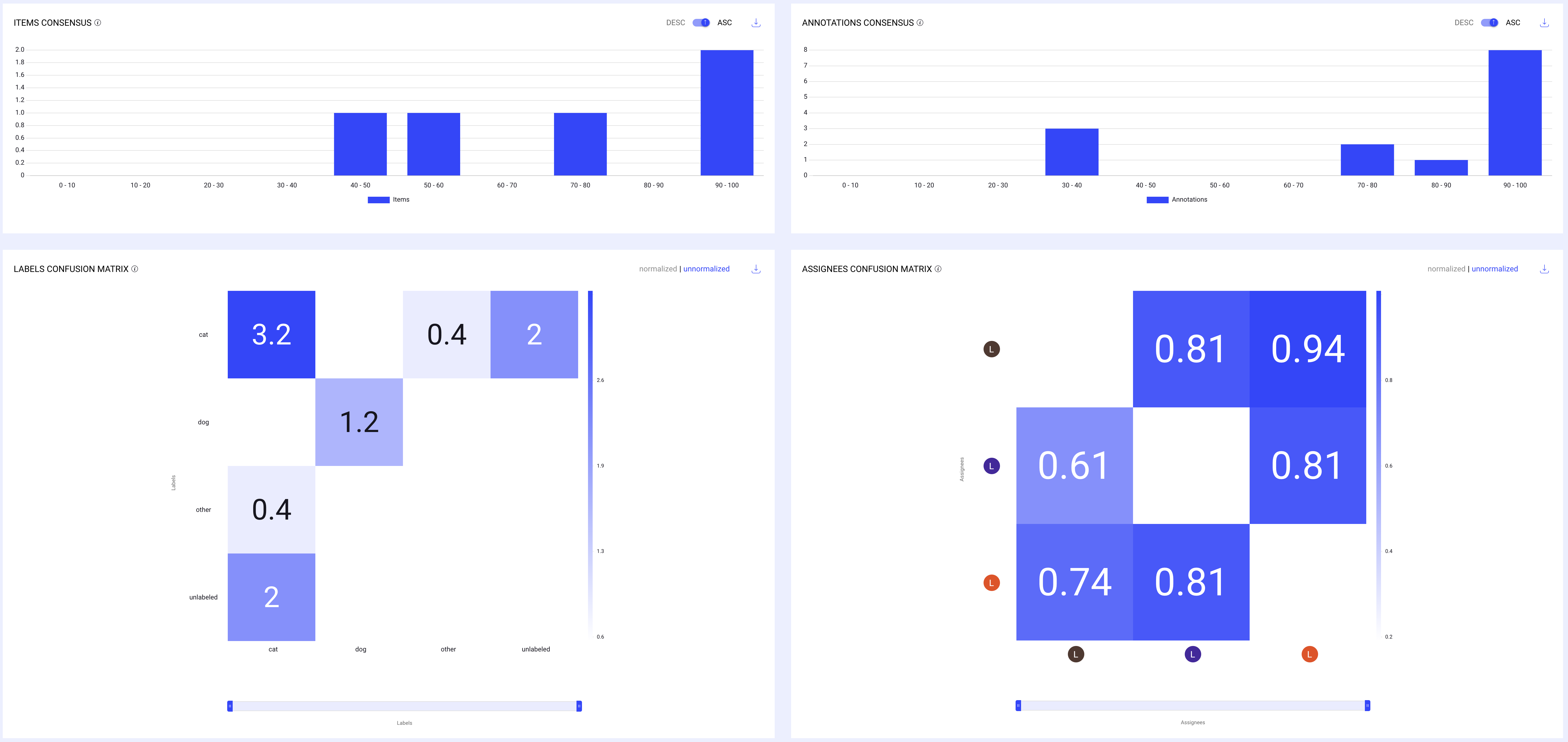
Click on a bar in the graphs or a cell in the confusion matrix to see the respective items or annotations in a dataset browser. It opens in a new tab.
Drill-in to the dataset browser is currently limited to 150 items.
Annotations Consensus
The Annotation Consensus graph provides insight into the level of agreement among annotators, helping you gauge the quality of the annotations more effectively.
The x-axis measures the number of annotations that fall within each consensus score range. The y-axis represents consensus score ranges (from 0-10 to 90-100), indicating the level of agreement among annotators.
Distribution of annotations according to their quality score.
Number of annotations by their average agreement score range (IOU, Labels, and Attributes consensus). For example, all annotations with an average score between 90 and 100.
Items Consensus
The Items Consensus chart is a visualization used to understand how consistently different evaluators or models agree on the classification or labeling of items within a dataset.
Distribution of items according to the average quality score of their annotations. Number of items by average agreement score range (IOU, Labels, and Attributes consensus) of all annotations in them.
The chart measures consensus or agreement levels among various assessors regarding specific items. This could be used in scenarios where multiple annotators label data, and it's important to measure how often they agree on their assessments.
It is presented as a histogram, where the x-axis represents ranges of consensus percentages (e.g., 0-10%, 10-20%, etc.), and the y-axis represents the number of items that fall into each consensus range.
For example, a high bar in the 90-100% range would indicate that many items received nearly unanimous agreement among annotators, suggesting high reliability in those annotations.
Click on the Download icon to download the data in a CSV file.
Consensus Graph Score Similarity
The Items Consensus and Annotations Consensus display similar scores. This occurs, for example, when an item is annotated by three different annotators, and each annotator assigns the same single label using the classification tool.

In such cases, each item has exactly one annotation, resulting in the number of items being equal to the number of annotations.
This alignment leads to similar results on both graphs.
Consensus Graph Score Differences
The Items Consensus and Annotations Consensus graphs will display different results when an item has more than one annotation.
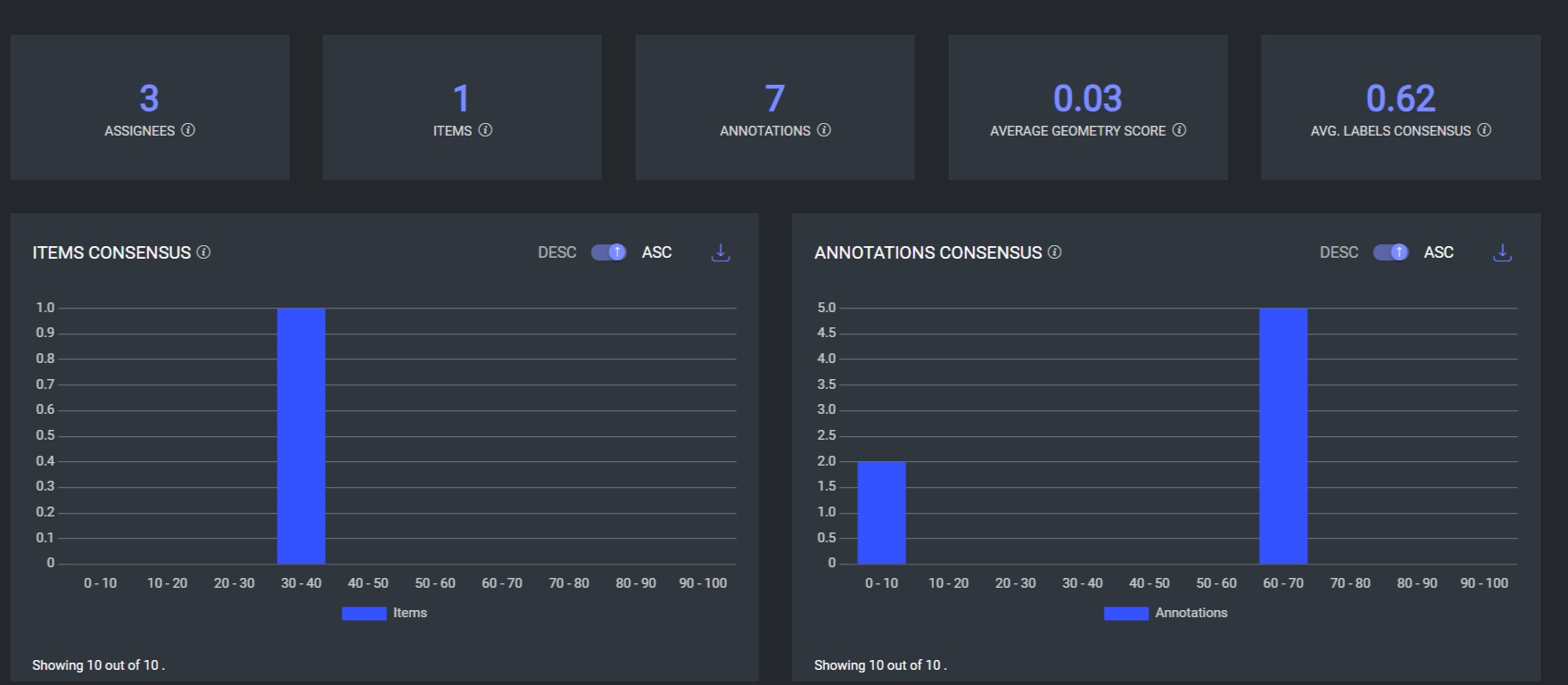
For example, consider a scenario where:
There are 3 items, each annotated by three assignees.
The 1st and 2nd assignees each annotated 2 annotations.
The 3rd assignee provided 3 annotations.
This results in a total of 7 annotations.
In this scenario:
The Items Consensus graph will show that there is only one item being compared across the three different users, focusing on the item-level agreement.
The Annotations Consensus graph, on the other hand, will display these 7 annotations and will provide a consensus agreement score for each annotation, showing the level of agreement on the annotations themselves rather than the items.
Assignees Confusion Matrix
A confusion matrix showing the level of agreement (IOU, Labels, and Attributes consensus) between all annotations of assignees. The X-axis shows the base list of assignees, and the Y-axis shows the reference list of assignees in the task.
The assignees' confusion matrix measures the agreement between each pair of assignees by comparing their annotations. For every pair, the cell value is determined by calculating the average of all annotation scores, relative to the other assignee in the pair.
Click on the Download icon to download the data in a CSV file.
Labels Confusion Matrix
A confusion matrix showing the level of agreement over the different annotation labels. The X-axis shows the list of labels as ground truth, and the Y-axis shows their confusion with other labels. In consensus tasks, where there’s no ground truth, the X-axis is the first assignees in the task, as a baseline.
Each cell in our label confusion matrix provides valuable insights into how different labels are compared during the annotation process.
The numbers you see in each cell indicate the frequency with which two annotators either agree on a label (e.g., both labeling an item as "dog") or when an annotation compares with a ground truth standard.
For instance, in our dog/cat dataset, if both annotators label an item as "dog," this agreement is recorded as '1' in the corresponding cell.
Currently, if the same item is labeled differently by annotators (even if it's the same bounding box), it is not counted as a match. This approach ensures clarity in identifying areas of consensus and disagreement.
Furthermore, the unlabeled category in the matrix indicates situations where one annotator has labeled an item, but another has missed it entirely.
These instances are also counted, enhancing our understanding of the annotation consistency and completeness.
Normalized and unnormalized confusion matrices: Click on the Normalized and unnormalized to view the confusion scores.
For example, the following image presents a confusion matrix with decimal values, possibly reflecting normalized data based on probabilities or percentages. The matrix includes categories for "cat," "dog," "other," and "unlabeled," indicating how often these labels are correctly or incorrectly applied.
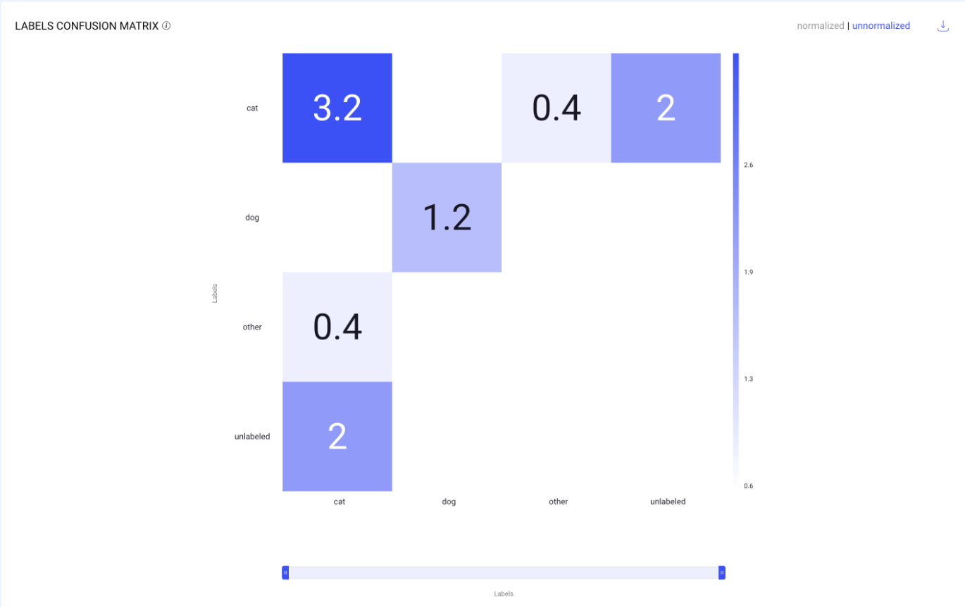
Here’s an analysis:
This is a confusion matrix used to visualize the performance of a classification model. Here’s a breakdown of its components:
Labels: These indicate the categories used by the model. In this case, the categories are "cat," "dog," "other," and "unlabeled."
Matrix Cells: Each cell in the matrix represents the count of instances for a predicted label versus the actual label.
The rows represent the actual labels.
The columns represent the predicted labels.
For example, the value 3.2 in the top left cell under "cat" and in the row for "cat" indicates that there were 3.2 instances where the model correctly predicted the actual label as "cat."
Off-diagonal Cells: These cells show where the model has made errors. For instance, the cell in the first row, second column (0.4) shows that there were 0.4 instances where the model incorrectly predicted "dog" when the actual label was "cat."
Color Intensity: Typically, the darker the color, the higher the count of instances for that cell, which helps in quickly identifying the most frequent predictions.
The matrix helps in assessing the model's ability to correctly classify each category and to see where it may be confusing one label for another.
Unnormalized and Normalized Confusion Matrices
Unnormalized Confusion Matrix
Unnormalized scores are the raw values generated directly by the scoring function without any adjustments. The values can vary widely based on the scale and units of the data, making comparisons difficult if the ranges differ significantly.
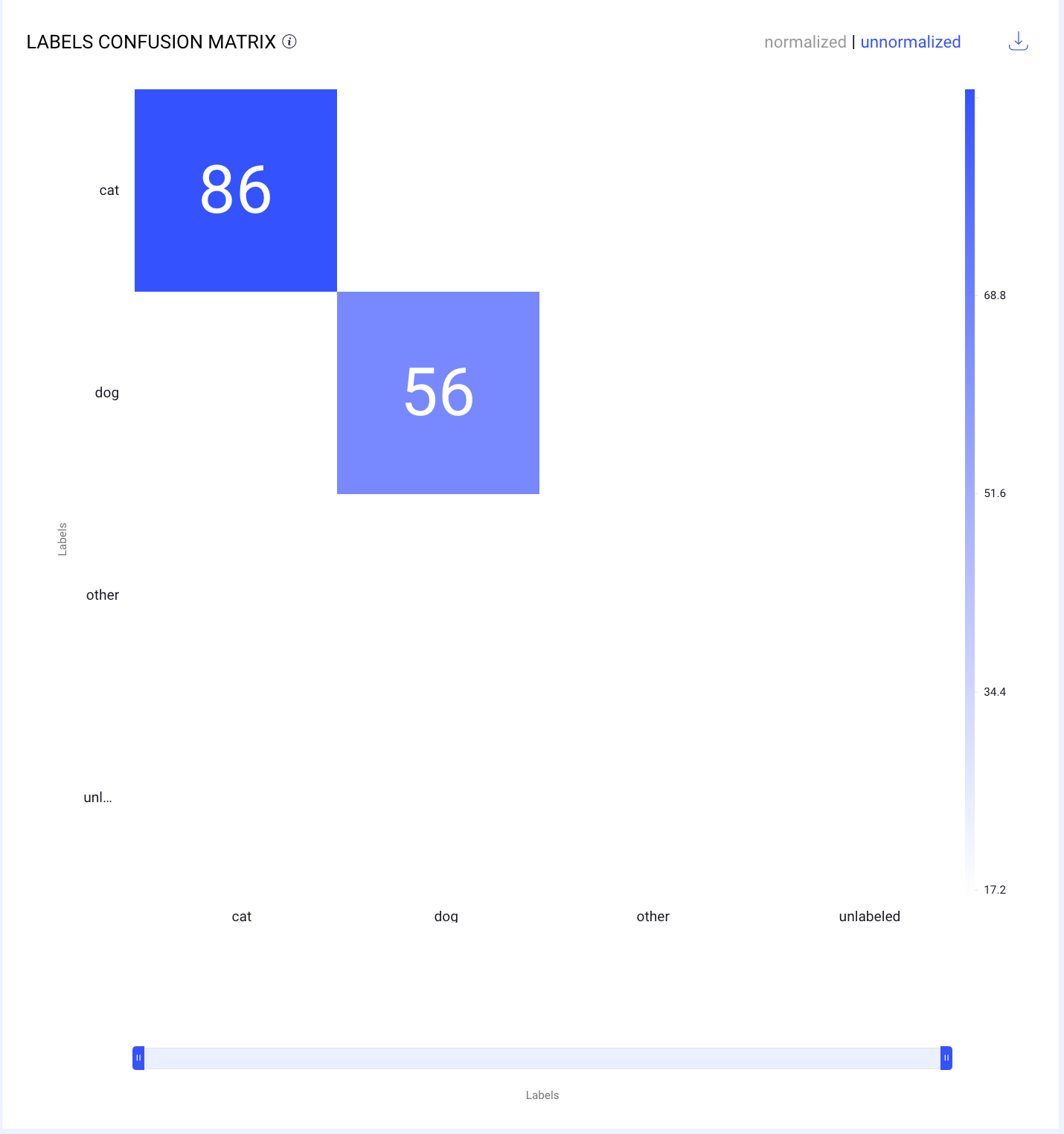
For example, as shown in the above screenshot:
The cells contain the number of instances for each combination of actual and predicted labels.
The cell corresponding to the actual label cat and predicted label cat shows 86, indicating that the model correctly identified 86 instances of cats.
The cell corresponding to the actual label dog and predicted label dog shows 56, meaning the model correctly identified 56 instances of dogs.
This matrix helps in understanding the absolute number of correct and incorrect predictions made by the model. It is useful for evaluating the model's performance in terms of raw counts.
Normalized Confusion Matrix
Normalized scores are adjusted values that have been scaled to a fixed range between 0 and 1. This process facilitates easier and more meaningful comparisons, and allows you to compare them across different datasets.
The normalization allows for a comparison of model performance across different classes without being influenced by the class sizes.
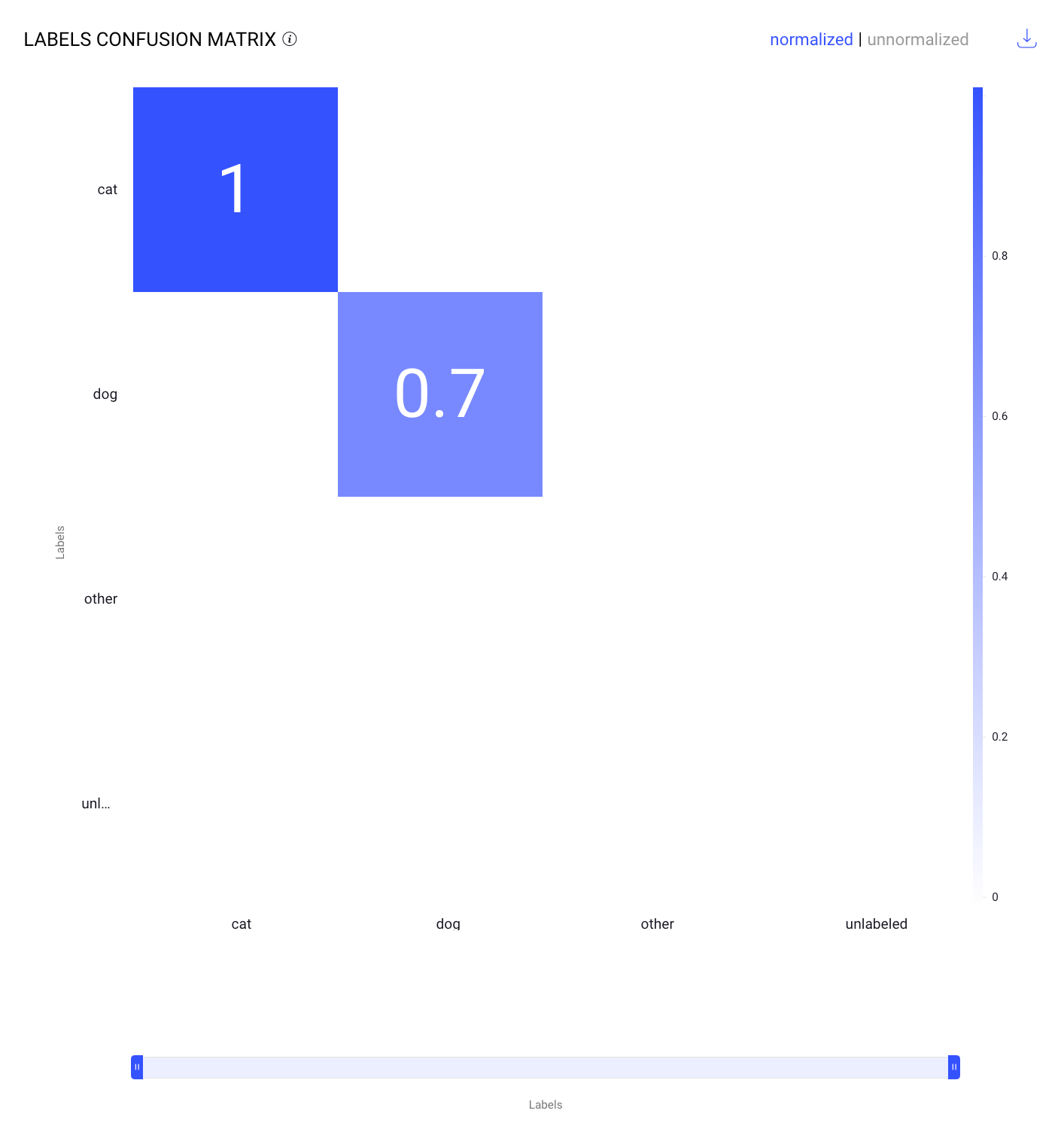
For example, as given in the above screenshot:
The cells display the proportion of instances for each combination of actual and predicted labels. To normalize these values, the score function divides each value by the highest value in the matrix, which is a score of 86.
The cell corresponding to the actual label cat and predicted label cat shows 1, meaning the model perfectly identified all instances of cat when normalized.
The cell corresponding to the actual label dog and predicted label dog shows 0.7, indicating that 70% of the actual dog instances were correctly identified when normalized.
This matrix helps in understanding the performance of the model in a standardized way, facilitating comparisons between different classes or models.