Overview
The Insights tab provides visibility into your dataset through interactive analytics and visualizations. It enables you to explore annotation patterns, label distributions, item characteristics, and other key dataset statistics from a centralized dashboard.
With tools such as annotation heatmaps, label histograms, attribute breakdowns, and annotation dimension analysis, Insights helps you better understand your data and maintain annotation quality.
You can view the available built-in graphs or create custom graphs to analyze your dataset based on your specific needs.
Access the Insights Application
You can access the Insights application directly from the Dataset Browser:
Dataset Browser → Insights tab
From there, you can explore analytics and visualizations related to your dataset.
Dashboard Overview
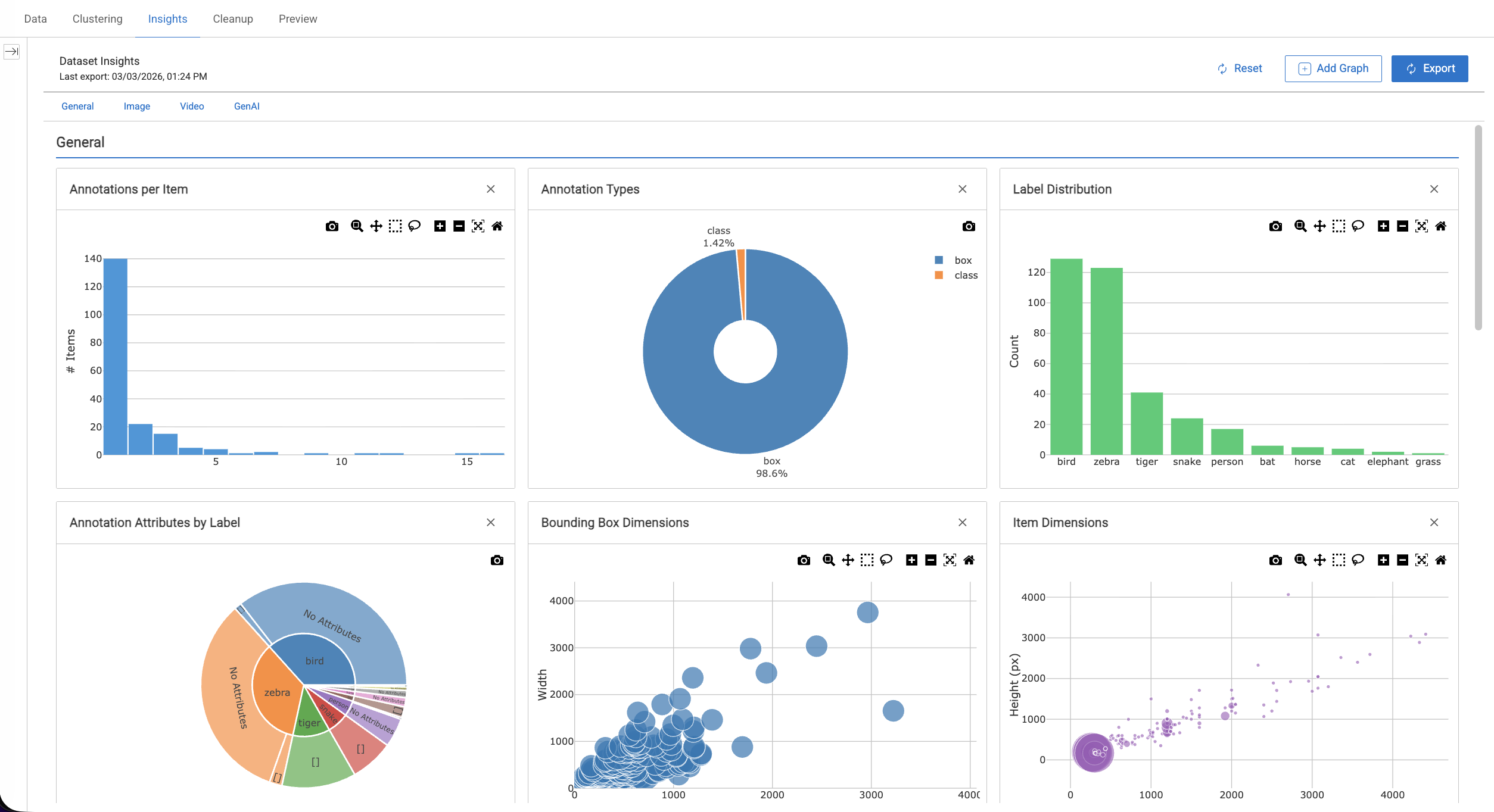
The Insights dashboard organizes graphs into four categories. By default, 12 built-in graphs are available for every dataset:
General: Annotation counts, label distribution, annotation types, attributes
Image: Item dimensions, annotation heatmaps, bounding box sizes
Video: Duration distribution, FPS distribution, frames vs duration
GenAI: Chunk size distribution, chunks per document.
Use the category buttons at the top of the dashboard to quickly navigate between sections. You can remove any default graph and use Reset to restore them.
Default Graphs
General Graphs
Annotations per Item
This widget displays the number of annotations per item in your dataset, providing a quick overview of how annotations are distributed across items.
It is presented as a histogram showing how many annotations each item contains, helping you assess annotation density and dataset coverage.
Annotation Types
This widget categorizes and visualizes annotations by type (such as bounding boxes, polygons, and points), helping you understand the variety and complexity of annotations present in your dataset.
Label Distribution
This widget displays a bar chart of annotation counts per label, helping you understand how labels are distributed across the dataset and identify dominant or underrepresented classes.
Annotation Attributes by Label
This widget displays a sunburst chart of annotation attributes grouped by label, showing how attributes are distributed across different classes. This visualization helps you understand how attribute values vary between labels.
Image Graphs
Item Dimensions
This widget displays a scatter plot of image width versus height, allowing you to analyze the distribution of item dimensions and identify potential outliers in image sizes.
Annotation Heatmap
This widget displays a density heatmap of annotation locations, showing where annotations most frequently appear within items. This visualization helps identify spatial patterns and common regions of interest in the dataset.
The heatmap also incorporates IOU (Intersection over Union) analysis by label color. IOU measures the overlap between predicted annotations and ground truth annotations and is calculated as: IOU = Area of Overlap / Area of Union
This metric helps evaluate the accuracy of bounding boxes or segmented areas.
Bounding Box Dimensions
This widget displays a scatter plot of bounding box width versus height, allowing you to analyze the size distribution of annotations and identify variations in object dimensions across the dataset.
Video Graphs
Video Duration Distribution
This widget displays a histogram of video durations, helping you understand how video lengths are distributed across the dataset.
FPS Distribution
This widget displays a histogram of video frame rates (FPS), allowing you to analyze the distribution of frame rates among video items.
Frames vs Duration
This widget displays a scatter plot of frame count versus video duration, helping you examine the relationship between video length and the total number of frames.
GenAI Graphs
Chunk Size Distribution
This widget displays a histogram of text chunk sizes, helping you understand how chunk lengths are distributed across the dataset.
Chunks per Document
This widget displays a bar chart of chunk counts per source document, allowing you to analyze how many chunks are generated from each document.
Widget Controls
Hover over the top of any widget to access available controls such as:
Download the plot as a PNG
Zoom
Pan
Box select
Additional controls depending on the visualization type.
Custom Graphs
You can create custom visualizations to analyze your dataset in more detail. Custom graphs allow you to explore dataset insights using Python and Plotly, enabling flexible and tailored data analysis.
Permission Required
Annotation Manager role and above can add Custom Graphs.
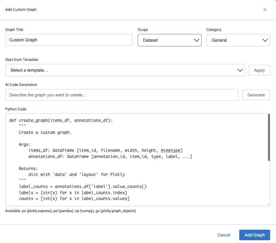
Add Custom Graph
Select the Data menu from the left-side panel.
Open a Dataset from the list.
Select the Insights tab. The default graphs are displayed.
Click Add Graph.
Select Custom Graph from the list. The Add custom graph popup is displayed.
Graph Title: Enter a Title for the graph.
Scope: Select a scope for the custom graph whether it is for a particular Dataset, or for the entire Project.
Dataset: Visible only for the current dataset. It will be deleted when you Reset.
Project: Visible across all datasets in the project. It will be preserved on Reset.
Category: Select the data type category of the custom graph.
Select a Template: Select a graph template from the list and click Apply. Learn more about the templates.
AI Code Generation: Enter a description for how you want your graph, and click Generate. AI helps to generate a Python code for you.
Learn more AI Code Generation.
Learn more about the Python templates.
Graph Templates
When creating a custom graph, you can start with one of the predefined templates instead of building the graph from scratch.
Template | Description |
|---|---|
Bar Chart | Displays annotation counts for each label |
Histogram | Shows the distribution of annotations across items |
Pie Chart | Visualizes the distribution of annotation types |
Scatter Plot | Plots item dimensions, such as width versus height |
Heatmap | Shows label co-occurrence patterns |
Line Chart | Used for sequential or time-series data |
Box Plot | Displays annotation statistics grouped by label |
Empty Template | Provides a minimal template to start building a custom graph |
Select a template and click Apply to load it into the editor.
AI Code Generation
You can generate graph code using natural language.
Enter a prompt such as:
“Show bounding box aspect ratio distribution grouped by label.”Click Generate.
Review and edit the generated code if needed.
Click Add Graph to save the graph.
The AI understands the available DataFrames and their columns, allowing you to describe the visualization in plain language.
DQL Filtering
When you apply Dataloop Query Language (DQL) filters in the platform, the Insights dashboard automatically updates to reflect the filtered data.
This allows you to:
Analyze graphs for a specific folder
Focus on a single label or class
Combine multiple filters to narrow your analysis
No additional configuration is required.
Limitations
Custom graph code runs in a restricted environment.
Limitation | Details |
|---|---|
No file I/O | Custom code cannot read or write files (pd.read_csv, open(), etc. are blocked) |
No network access | Custom code cannot make HTTP requests |
No process execution | Custom code cannot run system commands |
Column variability varies | Not all columns exist for every dataset type (e.g. video columns only exist for video datasets) |
Handle Missing data | Some columns may contain NaN -- use |
Re-export after changes: If you add/modify/delete items or annotations, click Export again to refresh the data
Python Code Template
To create a custom graph, you need to define a Python function that generates the visualization. Each custom graph is implemented using a function called create_graph.
def create_graph(items_df, annotations_df):
    """
    Args:
        items_df: pandas DataFrame with one row per item
        annotations_df: pandas DataFrame with one row per annotation

    Returns:
        dict with 'data' (list of Plotly traces) and 'layout' (Plotly layout dict)
    """
    # Your code here
    return {
        'data': [{ 'type': 'bar', 'x': [...], 'y': [...] }],
        'layout': { 'title': 'My Graph' }
    }
The function receives two DataFrames (items_df and annotations_df) must return a dictionary containing Plotly data and layout.
items_df
The items_df DataFrame contains information about the items in your dataset. Each row represents a single dataset item, such as an image, video, or document.
Column | Description |
|---|---|
| Unique item identifier |
| Item path in the dataset |
| Item width in pixels |
| Item height in pixels |
| MIME type (e.g. image/jpeg) |
| File size in bytes |
| Flattened system metadata |
| Flattened user metadata |
Video-specific columns
For datasets containing video items, the following additional fields are available to describe video properties.
Column | Description |
|---|---|
| Video duration in seconds |
| Frames per second |
| Total frame count |
GenAI / RAG columns
For GenAI or RAG datasets, the following additional fields are available for analyzing document chunking.
Column | Description |
|---|---|
| Size of text chunk |
| Reference to the source document from which the chunk was created |
All nested JSON fields are flattened with dot notation (e.g. metadata.system.width). The width, height, mimetype, and size columns are convenience aliases.
annotations_df
The annotations_df DataFrame contains information about annotations in the dataset. Each row represents a single annotation.
Column | Description |
|---|---|
annotation_id | Unique annotation identifier |
item_id | Parent item identifier |
type | Annotation type |
label | Annotation class |
attributes | Annotation attributes |
left / top / right / bottom | Bounding box coordinates |
annotation_width | Bounding box width |
annotation_height | Bounding box height |
metadata.system.* | System metadata |
metadata.user.* | User metadata |
Bounding box values are automatically computed from the annotation geometry using the Dataloop SDK.
The coordinate fields (left, top, right, bottom, annotation_width, annotation_height) are derived from each annotation’s geometry and are available for all annotation types that include a bounding region.
Available Libraries
Custom graph code can use the following pre-imported libraries:
Import | Library | Usage |
|---|---|---|
px | Create high-level charts such as bar, scatter, histogram, and pie | |
go | plotly.graph_objects | Build advanced Plotly visualizations with full control |
pd | pandas | Perform DataFrame manipulation and analysis |
np | numpy | Execute numerical operations |
Standard Python modules such as math, datetime, statistics, and json are also available.
Return Format
The create_graph function must return a dictionary containing the Plotly data and layout definitions. This structure allows the Insights dashboard to render the visualization correctly within the platform.
{
    "data": [...],    # List of Plotly trace dictionaries
    "layout": {...}   # Plotly layout dictionary
}
data defines the chart elements (bars, lines, scatter points, etc.).
layout controls the chart configuration, such as the title, axes, and visual styling.
Example using Plotly Express
A common approach is to create a figure using Plotly Express and then convert it into the required dictionary format:
fig = px.bar(x=labels, y=counts)

return {
    "data": fig.to_dict()["data"],
    "layout": fig.to_dict()["layout"]
}
This format ensures the graph can be interpreted and displayed properly by the Insights dashboard.
Convert Data Types
Plotly requires native Python data types when rendering visualizations. Values coming from pandas or NumPy objects should therefore be converted to standard Python types before returning them.
Always convert pandas or NumPy values to types such as lists, integers, or floats to ensure the graph renders correctly in the Insights dashboard.
# Do this
labels = annotations_df['label'].value_counts().index.tolist()
counts = annotations_df['label'].value_counts().values.tolist()

# Or this
labels = [str(x) for x in label_counts.index]
counts = [int(x) for x in label_counts.values]
Python Code Examples
Bounding Box Aspect Ratio by Class
Displays the distribution of bounding box aspect ratios grouped by annotation label, helping you analyze how object shapes vary across different classes.
def create_graph(items_df, annotations_df):
    df = annotations_df[annotations_df['annotation_width'] > 0].copy()
    df['aspect_ratio'] = df['annotation_width'] / df['annotation_height']

    fig = px.box(
        df,
        x='label',
        y='aspect_ratio',
        title='Bounding Box Aspect Ratio by Class'
    )
    return {
        'data': fig.to_dict()['data'],
        'layout': fig.to_dict()['layout']
    }
Bounding Box Size Distribution
Shows the distribution of bounding box areas across annotations, helping you understand object size variations within the dataset.
def create_graph(items_df, annotations_df):
    df = annotations_df.copy()
    df['area'] = df['annotation_width'] * df['annotation_height']
    df = df[df['area'] > 0]

    fig = px.histogram(
        df,
        x='area',
        color='label',
        title='Bounding Box Area Distribution',
        nbins=50
    )
    return {
        'data': fig.to_dict()['data'],
        'layout': fig.to_dict()['layout']
    }
Annotation Size Relative to Image
Shows how large annotations are relative to their corresponding images, helping you understand the proportion of objects within each item.
def create_graph(items_df, annotations_df):
    merged = annotations_df.merge(
        items_df[['item_id', 'width', 'height']],
        on='item_id',
        suffixes=('', '_item')
    )
    merged['relative_width'] = merged['annotation_width'] / merged['width']
    merged['relative_height'] = merged['annotation_height'] / merged['height']

    fig = px.scatter(
        merged,
        x='relative_width',
        y='relative_height',
        color='label',
        title='Annotation Size Relative to Image',
        labels={
            'relative_width': 'Width (% of image)',
            'relative_height': 'Height (% of image)'
        }
    )
    return {
        'data': fig.to_dict()['data'],
        'layout': fig.to_dict()['layout']
    }
Items Without Annotations
Displays the proportion of dataset items with and without annotations, helping you identify gaps in annotation coverage.
def create_graph(items_df, annotations_df):
    annotated_ids = set(annotations_df['item_id'].unique())
    items_df = items_df.copy()
    items_df['has_annotations'] = items_df['item_id'].isin(annotated_ids)

    counts = items_df['has_annotations'].value_counts()
    labels = ['With Annotations', 'Without Annotations']
    values = [
        int(counts.get(True, 0)),
        int(counts.get(False, 0))
    ]

    return {
        'data': [{
            'type': 'pie',
            'labels': labels,
            'values': values,
        }],
        'layout': {'title': 'Annotation Coverage'}
    }
Label Co-occurrence Heatmap
Visualizes how often different labels appear together within the same item, helping you identify relationships or dependencies between annotation classes.
def create_graph(items_df, annotations_df):
    labels_per_item = annotations_df.groupby('item_id')['label'].apply(set)

    all_labels = sorted(annotations_df['label'].unique())
    matrix = [[0] * len(all_labels) for _ in range(len(all_labels))]

    label_to_idx = {l: i for i, l in enumerate(all_labels)}
    for label_set in labels_per_item:
        for a in label_set:
            for b in label_set:
                matrix[label_to_idx[a]][label_to_idx[b]] += 1

    return {
        'data': [{
            'type': 'heatmap',
            'z': matrix,
            'x': all_labels,
            'y': all_labels,
            'colorscale': 'Blues'
        }],
        'layout': {'title': 'Label Co-occurrence'}
    }
Annotations per Image Dimension Bucket
Shows the average number of annotations across different image size ranges, helping you understand how annotation density varies with image resolution.
def create_graph(items_df, annotations_df):
    counts = annotations_df.groupby('item_id').size().reset_index(name='ann_count')
    merged = items_df.merge(counts, on='item_id', how='left').fillna(0)

    merged['megapixels'] = (merged['width'] * merged['height']) / 1_000_000
    merged['size_bucket'] = pd.cut(
        merged['megapixels'],
        bins=[0, 0.5, 1, 2, 5, 100],
        labels=['<0.5 MP', '0.5-1 MP', '1-2 MP', '2-5 MP', '5+ MP']
    )

    summary = merged.groupby('size_bucket', observed=True)['ann_count'].mean()

    return {
        'data': [{
            'type': 'bar',
            'x': [str(x) for x in summary.index],
            'y': summary.values.tolist(),
            'marker': {'color': '#2ecc71'}
        }],
        'layout': {
            'title': 'Avg Annotations by Image Size',
            'xaxis': {'title': 'Image Size'},
            'yaxis': {'title': 'Avg Annotation Count'}
        }
    }